編輯:關於Android編程
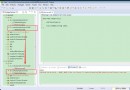
最近一直在學習自定義View相關的知識,今天給大家帶來的是QQ健康界面的實現。先看效果圖:
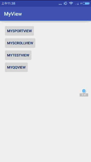
可以設置數字顏色,字體顏色,運動步數,運動排名,運動平均步數,虛線下方的藍色指示條的長度會隨著平均步數改變而進行變化。整體效果還是和QQ運動健康界面很像的。
自定義View四部曲,一起來看看怎麼實現的。
1.自定義view的屬性:
<?xml version="1.0" encoding="utf-8"?>
<resources>
 //自定義屬性名,定義公共屬性
 <attr name="titleSize" format="dimension"></attr>
 <attr name="titleText" format="string"></attr>
 <attr name="titleColor" format="color"></attr>
 <attr name="outCircleColor" format="color"></attr>
 <attr name="inCircleColor" format="color"></attr>
 <attr name="lineColor" format="color"></attr>
 //自定義View的屬性
 <declare-styleable name="MyQQHealthView">
 <attr name="titleColor"></attr>
 <attr name="lineColor"></attr>
 </declare-styleable>
</resources>
依次定義了字體顏色,線的顏色2個屬性,format是該屬性的取值類型。
然後就是在布局文件中申明我們的自定義view:
 <com.example.tangyangkai.myview.MyQQHealthView
  android:id="@+id/myQQView"
  android:layout_width="match_parent"
  android:layout_height="530dp"
  android:layout_margin="15dp"
  myQQ:lineColor="@color/font_tips"
  myQQ:titleColor="@color/textcolor"
  myQQ:titleSize="50dp" />
自定義view的屬性我們可以自己進行設置,記得最後要引入我們的命名空間,
xmlns:app=”http://schemas.Android.com/apk/res-auto”
2.獲取自定義view的屬性:
 public MyQQHealthView(Context context) {
 this(context, null);
 }

 public MyQQHealthView(Context context, AttributeSet attrs) {
 this(context, attrs, 0);
 }

 public MyQQHealthView(Context context, AttributeSet attrs, int defStyleAttr) {
 super(context, attrs, defStyleAttr);

 //獲取我們自定義的樣式屬性
 TypedArray array = context.getTheme().obtainStyledAttributes(attrs, R.styleable.MyQQHealthView, defStyleAttr, 0);
 int n = array.getIndexCount();
 for (int i = 0; i < n; i++) {
  int attr = array.getIndex(i);
  switch (attr) {
  case R.styleable.MyQQHealthView_titleColor:
   // 默認顏色設置為黑色
   textColor = array.getColor(attr, Color.BLACK);
   break;
  case R.styleable.MyQQHealthView_lineColor:
   lineColor = array.getColor(attr, Color.BLACK);
   break;
  }

 }
 array.recycle();
 init();
 }
自定義View一般需要實現一下三個構造方法,這三個構造方法是一層調用一層的,屬於遞進關系。因此,我們只需要在最後一個構造方法中來獲得View的屬性了。
第一步通過theme.obtainStyledAttributes()方法獲得自定義控件的主題樣式數組;
第二步就是遍歷每個屬性來獲得對應屬性的值,也就是我們在xml布局文件中寫的屬性值;
第三步就是在循環結束之後記得調用array.recycle()來回收資源;
第四步就是進行一下必要的初始化,不建議在onDraw的過程中去實例化對象,因為這是一個頻繁重復執行的過程,new是需要分配內存空間的,如果在一個頻繁重復的過程中去大量地new對象會造成內存浪費的情況。
3.重寫onMesure方法確定view大小:
當你沒有重寫onMeasure方法時候,系統調用默認的onMeasure方法:
@Override
 protected void onMeasure(int widthMeasureSpec, int heightMeasureSpec) {
 super.onMeasure(widthMeasureSpec, heightMeasureSpec);
 }
這個方法的作用是:測量控件的大小。其實Android系統在加載布局的時候是由系統測量各子View的大小來告訴父View我需要占多大空間,然後父View會根據自己的大小來決定分配多大空間給子View。MeasureSpec的specMode模式一共有三種:
MeasureSpec.EXACTLY:父視圖希望子視圖的大小是specSize中指定的大小;一般是設置了明確的值或者是MATCH_PARENT
MeasureSpec.AT_MOST:子視圖的大小最多是specSize中的大小;表示子布局限制在一個最大值內,一般為WARP_CONTENT
MeasureSpec.UNSPECIFIED:父視圖不對子視圖施加任何限制,子視圖可以得到任意想要的大小;表示子布局想要多大就多大,很少使用。
想要設置WARP_CONTENT,只要重寫onMeasure方法:
 @Override
 protected void onMeasure(int widthMeasureSpec, int heightMeasureSpec) {
 int widthMode = MeasureSpec.getMode(widthMeasureSpec);
 int widthSize = MeasureSpec.getSize(widthMeasureSpec);
 int heightMode = MeasureSpec.getMode(heightMeasureSpec);
 int heightSize = MeasureSpec.getSize(heightMeasureSpec);
 int width;
 int height;
 //如果布局裡面設置的是固定值,這裡取布局裡面的固定值;如果設置的是match_parent,則取父布局的大小
 if (widthMode == MeasureSpec.EXACTLY) {
  width = widthSize;
 } else {

  //如果布局裡面沒有設置固定值,這裡取布局的寬度的1/2
  width = widthSize * 1 / 2;
 }

 if (heightMode == MeasureSpec.EXACTLY) {
  height = heightSize;
 } else {
  //如果布局裡面沒有設置固定值,這裡取布局的高度的3/4
  height = heightSize * 3 / 4;
 }
 widthBg = width;
 heightBg = height;
 setMeasuredDimension(width, height);
 startAnim();
 }
我這裡為了不讓布局顯得過小,所以WARP_CONTENT分別取寬的1/2,高的3/4,具體情況因人而異。
4.重寫onDraw方法進行繪畫:
界面比較復雜,我們從上到下,一步一步來:
 //繪制最底層的背景
 radiusBg = widthBg / 20;
 pathBg.moveTo(0, heightBg);
 pathBg.lineTo(0, radiusBg);
 pathBg.quadTo(0, 0, radiusBg, 0);
 pathBg.lineTo(widthBg - radiusBg, 0);
 pathBg.quadTo(widthBg, 0, widthBg, radiusBg);
 pathBg.lineTo(widthBg, heightBg);
 pathBg.lineTo(0, heightBg);
 backgroundPaint.setColor(Color.WHITE);
 canvas.drawPath(pathBg, backgroundPaint);
整個自定義View的最底層是一個左上,右上有弧度,左下,右下為直角的白色背景。使用canvas.drawRoundRect實現的矩形是四個角都有弧度,達不到預期。但是一階貝塞爾曲線加上二階貝塞爾曲線就能很好的實現這種特殊的情況。
moveTo(x,y):不會進行繪制,只用於移動移動畫筆,確定起點坐標,與其他方法配合使用;
lineTo(x,y):一階貝塞爾曲線,坐標為終點坐標,配合moveTo方法用於進行直線繪制;
quadTo (x1,y1,x2,y2):二階貝塞爾曲線,(x1,y1) 為控制點,(x2,y2)為結束點,用於繪制圓滑的曲線;
最後調用canvas.drawPath(path,paint)即可達到這種效果
 //繪制圓弧
 arcPaint.setStrokeWidth(widthBg / 20);
 //設置空心
 arcPaint.setStyle(Paint.Style.STROKE);
 //防抖動
 arcPaint.setDither(true);
 //連接處為圓弧
 arcPaint.setStrokeJoin(Paint.Join.ROUND);
 //畫筆的筆觸為圓角
 arcPaint.setStrokeCap(Paint.Cap.ROUND);
 arcPaint.setColor(lineColor);
 //圓弧范圍
 arcRect = new RectF(widthBg * 1 / 4, widthBg * 1 / 4, widthBg * 3 / 4, widthBg * 3 / 4);
 //繪制背景大圓弧
 canvas.drawArc(arcRect, 120, 300, false, arcPaint);
 arcPaint.setColor(textColor);
 //繪制分數小圓弧
 canvas.drawArc(arcRect, 120, arcNum, false, arcPaint);
繪制圓弧先確定圓弧的范圍,傳入的四個參數就是圓弧所在圓的外接矩形的坐標。canvas.drawArc的五個參數依次是圓弧范圍;開始的角度;圓弧的角度;第四個為True時,在繪制圓弧時會將圓心包括在內,通常用來繪制扇形,我們這裡選false;圓弧的畫筆
 //繪制圓圈內的數字
 textPaint.setColor(textColor);
 textPaint.setTextSize(widthBg / 10);
 canvas.drawText(String.valueOf(walkNum), widthBg * 3 / 8, widthBg * 1 / 2 + 20, textPaint);
 //繪制名次
 textPaint.setTextSize(widthBg / 15);
 canvas.drawText(String.valueOf(rankNum), widthBg * 1 / 2 - 15, widthBg * 3 / 4 + 10, textPaint);

 //繪制其他文字
 textPaint.setColor(lineColor);
 textPaint.setTextSize(widthBg / 25);
 canvas.drawText("截止13:45已走", widthBg * 3 / 8 - 10, widthBg * 5 / 12 - 10, textPaint);
 canvas.drawText("好友平均2781步", widthBg * 3 / 8 - 10, widthBg * 2 / 3 - 20, textPaint);
 canvas.drawText("第", widthBg * 1 / 2 - 50, widthBg * 3 / 4 + 10, textPaint);
 canvas.drawText("名", widthBg * 1 / 2 + 30, widthBg * 3 / 4 + 10, textPaint);

 //繪制圓圈外的文字
 canvas.drawText("最近7天", widthBg * 1 / 15, widthBg, textPaint);
 myaverageTxt = String.valueOf(averageSize);
 canvas.drawText("平均", widthBg * 10 / 15 - 15, widthBg, textPaint);
 canvas.drawText(myaverageTxt, widthBg * 11 / 15, widthBg, textPaint);
 canvas.drawText("步/天", widthBg * 12 / 15 + 20, widthBg, textPaint);
繪制文字就稍微簡單點,這裡計算好各自的位置即可
 //繪制虛線
 linePaint.setStyle(Paint.Style.STROKE);
 linePaint.setStrokeWidth(2);
 linePaint.setColor(lineColor);
 linePath.moveTo(widthBg * 1 / 15, widthBg + 80);
 linePath.lineTo(widthBg * 14 / 15, widthBg + 80);
 linePaint.setPathEffect(effects);
 canvas.drawPath(linePath, linePaint);

 rectSize = widthBg / 12;
 rectAgHeight = widthBg / 10;
 //繪制虛線上的圓角豎線
 for (int i = 0; i < FourActivity.sizes.size(); i++) {
  rectPaint.setStrokeWidth(widthBg / 25);
  rectPaint.setStyle(Paint.Style.STROKE);
  rectPaint.setStrokeJoin(Paint.Join.ROUND);
  rectPaint.setStrokeCap(Paint.Cap.ROUND);
  float startHeight = widthBg + 90 + rectAgHeight;
  rectPath.moveTo(rectSize, startHeight);
  double percentage = Double.valueOf(FourActivity.sizes.get(i)) / Double.valueOf(averageSize);
  double height = percentage * rectAgHeight;
  rectPath.lineTo(rectSize, (float) (startHeight - height));
  rectPaint.setColor(textColor);
  canvas.drawPath(rectPath, rectPaint);
  //繪制下方的文字
  textPaint.setColor(lineColor);
  canvas.drawText("0" + (i + 1) + "日", rectSize - 25, startHeight + 50, textPaint);
  rectSize += widthBg / 7;
 }
DashPathEffect的作用就是將Path的線段虛線化。構造函數為DashPathEffect(float[] intervals, float offset),其中intervals為虛線的ON和OFF數組,該數組的length必須大於等於2,float[0] ,float[1] 依次代表第一條實線與第一條虛線的長度,如果數組後面不再有數據則重復第一個數以此往復循環。offset為繪制時的偏移量。
DashPathEffect effects = new DashPathEffect(new float[]{5,5}, 1);
然後將這個實例作為linePaint.setPathEffect()的參數即可。繪制下方文字寫的是一個簡單的循環,然後豎線的長度是根據步數數組大小來進行計算的。示例圖中改變平均步數以後,豎線的長度也進行了變化。
 //繪制底部波紋
 weavPaint.setColor(textColor);
 weavPath.moveTo(0, heightBg);
 weavPath.lineTo(0, heightBg * 10 / 12);
 weavPath.cubicTo(widthBg * 1 / 10, heightBg * 10 / 12, widthBg * 3 / 10, heightBg * 11 / 12, widthBg, heightBg * 10 / 12);
 weavPath.lineTo(widthBg, heightBg);
 weavPath.lineTo(0, heightBg);
 canvas.drawPath(weavPath, weavPaint);

 //繪制底部文字
 weavPaint.setColor(Color.WHITE);
 weavPaint.setTextSize(widthBg / 20);
 canvas.drawText("成績不錯,繼續努力喲!", widthBg * 1 / 10 - 20, heightBg * 11 / 12 + 50, weavPaint);
底部水波紋的實現使用的是三階貝塞爾曲線:
cubicTo(x1, y1, x2, y2, x3, y3):三階貝塞爾曲線, (x1,y1) 為控制點,(x2,y2)為控制點,(x3,y3) 為結束點,用於繪制復雜的曲線。
關於重寫onDraw方法,個人建議就是最好在本子上將需要完成的自定義view大致輪廓畫下來,標注好坐標與位置,計算一下高寬。然後根據繪制的自定義View,從上到下,從外到內,一步一步進行繪制。真的很實用,這樣邏輯清晰,層次分明,對你寫代碼很有幫助。
5.動畫的實現:
 private void startAnim() {
 //步數動畫的實現
 ValueAnimator walkAnimator = ValueAnimator.ofInt(0, mySize);
 walkAnimator.addUpdateListener(new ValueAnimator.AnimatorUpdateListener() {
  @Override
  public void onAnimationUpdate(ValueAnimator animation) {
  walkNum = (int) animation.getAnimatedValue();
  postInvalidate();
  }
 });
 //排名動畫的實現
 ValueAnimator rankAnimator = ValueAnimator.ofInt(0, rank);
 rankAnimator.addUpdateListener(new ValueAnimator.AnimatorUpdateListener() {
  @Override
  public void onAnimationUpdate(ValueAnimator animation) {
  rankNum = (int) animation.getAnimatedValue();
  postInvalidate();
  }
 });

 double size = mySize;
 double avgSize = averageSize;
 if (size > avgSize) {
  size = avgSize;
 }
 //圓弧動畫的實現
 ValueAnimator arcAnimator = ValueAnimator.ofFloat(0, (float) (size / avgSize * 300));
 arcAnimator.addUpdateListener(new ValueAnimator.AnimatorUpdateListener() {
  @Override
  public void onAnimationUpdate(ValueAnimator animation) {
  arcNum = (float) animation.getAnimatedValue();
  postInvalidate();
  }
 });
 animSet.setDuration(3000);
 animSet.playTogether(walkAnimator, rankAnimator, arcAnimator);
 animSet.start();
 }
這裡就不得不提到屬性動畫的優越性了,不僅可以作用在view上,也可以作用於某個對象上。只需要設置好開始值與結束值,添加一個動畫的監聽,就能夠得到變化的值,再使用postInvalidate()方法,從而調用onDraw方法來進行數值的改變。最後設置一個組合動畫—-AnimatorSet,使三個動畫達到同步一致的效果。
然後就是使用動畫了,剛開始我是將這個方法寫在init()初始化函數裡面,一直達不到預期的效果。後來才知道,自定義View進行初始化的時候,組合動畫需要的一些值:步數,排名,平均步數等還沒有傳遞過來,所以動畫無法完成。最後我是將這個方法寫在onMeasure()方法的後面才達到效果,這裡很感謝同事的提醒。
6.設置步數大小以及在Activity中的使用:
 public void reSet(int mysize, int myrank, int myaverageSize) {
 walkNum = 0;
 arcNum = 0;
 rankNum = 0;
 mySize = mysize;
 rank = myrank;
 averageSize = myaverageSize;
 startAnim();
 }
將設置的值通過構造方法傳遞過來,最後調用開啟動畫的方法即可。對應的Activity的代碼:
public class FourActivity extends AppCompatActivity {

 private MyQQHealthView view;
 public static List<Integer> sizes = new ArrayList<>();
 private Button btn;
 @Override
 protected void onCreate(Bundle savedInstanceState) {
 super.onCreate(savedInstanceState);
 setContentView(R.layout.activity_four);
 initview();
 }

 private void initview() {
 view = (MyQQHealthView) findViewById(R.id.myQQView);
 view.setMySize(2345);
 view.setRank(11);
 view.setAverageSize(5436);
 sizes.add(1234);
 sizes.add(2234);
 sizes.add(4234);
 sizes.add(6234);
 sizes.add(3834);
 sizes.add(7234);
 sizes.add(5436);
 btn = (Button) findViewById(R.id.set_btn);
 btn.setOnClickListener(new View.OnClickListener() {
  @Override
  public void onClick(View v) {
  view.reSet(6534, 8, 4567);
  }
 });
 }
}
自己根據情況設置想要的值就可以了。
整個流程走下來,你會發現其實自定義View並沒有想象之中的那麼難。多加練習,熟能生巧,相信再復雜的界面也難不住我們的。
OK,下一篇自定義View再見。
以上就是本文的全部內容,希望對大家的學習有所幫助,也希望大家多多支持本站。
 怎麼修改手機qq字體 如何修改手機qq字體顏色
手機qq聊天字體用膩了怎麼修改,字體顏色又是怎麼修改的呢?具體操作如下,一起來看看吧!如何修改手機qq字體顏色用手機管理器進入 E:System→
 android開發筆記之高級主題—傳感器的簡單介紹
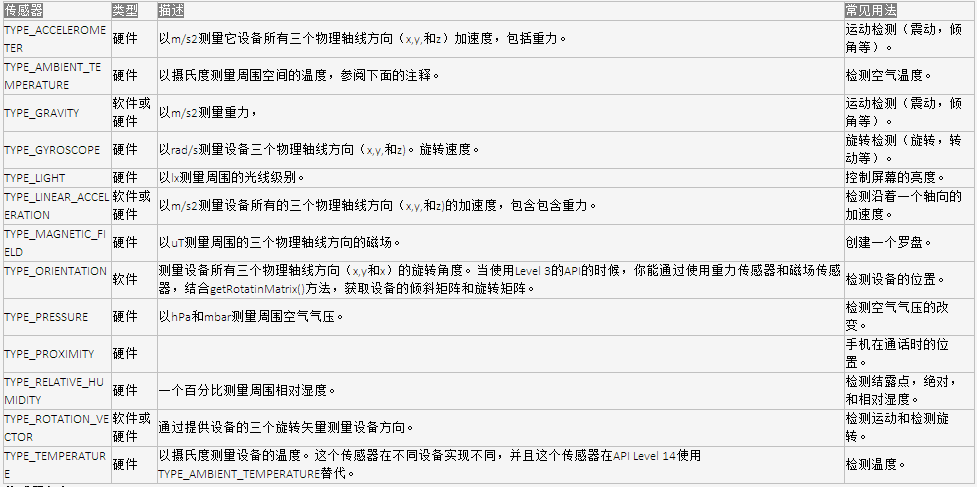
今天我們開始進入講解android中的一些高級主題的用法,比如傳感器、GPS、NFC、語音和人臉識別等。這次來對傳感器的一個簡單介紹:Android平台支持三大類的傳感器
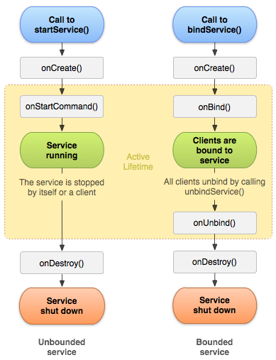
 Android -- 跨應用綁定service並通信
第一步,需要修改service1項目中aidl,增加一個方法。package com.example.service1.aidl; interface IM
 android JNI的.so庫調用
在一篇博客中看到一篇文章,感覺描述的還可以:在前面的博客中介紹的都是使用java開發Android應用,這篇博客將介紹java通過使用jni調用c語言做開發為了更加形象的