編輯:關於Android編程
1.案例效果圖

2.准備素材
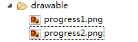


progress1.png(78*78) progress2.png(78*78)
3.原理
采用一張圖片作為ProgressBar的背景圖片(一般采用顏色比較淺的)。另一張是進度條的圖片(一般采用顏色比較深的圖片)。進度在滾動時:進度圖片逐步顯示,背景圖片逐步隱藏,達到上面的效果。
4.靈感來自Android控件提供的源碼
4.1 默認帶進度的進度條,如下圖
<ProgressBar
android:id="@+id/progressBar2"

android:layout_width="268dp"
android:layout_height="wrap_content"
android:progress="45" />

注意:關鍵是style屬性在起作用
4.2 找到樣式定義的位置
鼠標放在style屬性值上,按下Ctrl鍵,出現超鏈接,點擊超鏈接跳轉到樣式的定義位置

樣式定義的內容如下
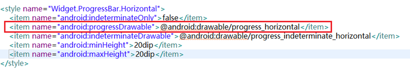
重點研究:
android:progressDrawable:進度條的樣式
@android:drawable/progress_horizontal:樣式定義的文件
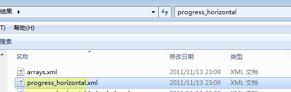
在android-sdk-windows\platforms\android-14\data\res目下搜索progress_horizontal.xml文件,搜索結果如下:
打開progress_horizontal.xml文件,內容如下
<layer-listxmlns:android="http://schemas.android.com/apk/res/android">
<itemandroid:id="@android:id/background">
<shape>
<cornersandroid:radius="5dip"/>
<gradient
android:startColor="#ff9d9e9d"
android:centerColor="#ff5a5d5a"
android:centerY="0.75"
android:endColor="#ff747674"
android:angle="270"
/>
</shape>
</item>
<itemandroid:id="@android:id/secondaryProgress">
<clip>
<shape>
<cornersandroid:radius="5dip"/>
<gradient
android:startColor="#80ffd300"
android:centerColor="#80ffb600"
android:centerY="0.75"
android:endColor="#a0ffcb00"
android:angle="270"
/>
</shape>
</clip>
</item>
<itemandroid:id="@android:id/progress">
<clip>
<shape>
<cornersandroid:radius="5dip"/>
<gradient
android:startColor="#ffffd300"
android:centerColor="#ffffb600"
android:centerY="0.75"
android:endColor="#ffffcb00"
android:angle="270"
/>
</shape>
</clip>
</item>
</layer-list>
釋義:
<item android:id="@android:id/background">:定義進度條的背景樣式
<item android:id="@android:id/secondaryProgress">:輔助進度條的樣式
<item android:id="@android:id/progress">:進度條的樣式
思考:如果我想做垂直進度條,怎麼辦了?
關鍵在clip元素的屬性上做修改
<clip
android:clipOrientation="vertical" 定義滾動的方向 vertical為垂直方向
android:drawable="@drawable/progress1" 定義進度的圖片
android:gravity="bottom" > 定義進度的開始位置
</clip>
5.定義樣式文件progress_vertical.xml
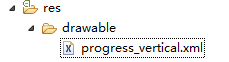
progress_vertical.xml文件代碼如下
<?xmlversion="1.0"encoding="utf-8"?>
<layer-listxmlns:android="http://schemas.android.com/apk/res/android">
<itemandroid:id="@android:id/progress">
<clip
android:clipOrientation="vertical"
android:drawable="@drawable/progress1"
android:gravity="bottom">
</clip>
</item>
</layer-list>
6.應用自定義的樣式
<Button
android:id="@+id/btStart"
android:layout_width="fill_parent"
android:layout_height="wrap_content"
android:layout_marginTop="150dp"
android:text="開始"/>
<ProgressBar
android:id="@+id/pbPic"

android:layout_width="50dp"
android:layout_height="68dp"
android:background="@drawable/progress2"
android:max="100"
android:progress="0"
android:progressDrawable="@drawable/progress_vertical" /> <!-- 在此屬性上應用 -->
<TextView
android:id="@+id/txtProgress"
android:layout_width="wrap_content"
android:layout_height="wrap_content"/>
7.點擊按鈕模擬進度滾動的效果
publicclass ProgressActivity extends Activity {
ProgressBar pb = null;
TextView txtProgress;
Handler handler = new Handler();
@Override
publicvoid onCreate(Bundle savedInstanceState) {
super.onCreate(savedInstanceState);
setContentView(R.layout.main);
System.out.println("主題=" + getTheme() + "");
pb = (ProgressBar) findViewById(R.id.pbPic);
Button btnStart = (Button) findViewById(R.id.btStart);//按鈕
txtProgress = (TextView) findViewById(R.id.txtProgress);//顯示進度
btnStart.setOnClickListener(new OnClickListener() {//按鈕點擊事件
publicvoid onClick(View v) {
new Thread(new Runnable() {//創建並啟動線程,使用線程執行模擬的任務
publicvoid run() {
for (inti = 0; i < 100; i++) { //循環100遍
try {
handler.post(new Runnable() { //更新界面的數據
publicvoid run() {
pb.incrementProgressBy(1);//增加進度
txtProgress.setText(pb.getProgress() + "%");//顯示完成的進度
}
});
Thread.sleep(100);
} catch (InterruptedException e) {
}
}
}
}).start();
}
});
}
}
以上所述是小編給大家介紹的Android實現個性化的進度條,希望對大家有所幫助,如果大家有任何疑問請給我留言,小編會及時回復大家的。在此也非常感謝大家對本站網站的支持!
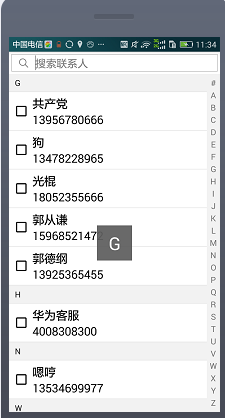 android通訊錄搜索,通過輸入框搜索以及側邊litview的滾動搜索,還有單選,全選以及反選的功能
由於項目需要做一個仿通訊錄搜索聯系人的功能,並且需要選中聯系人,即推薦好友的功能。所以就想寫一遍blog來介紹它是怎麼實現,以及是怎麼用的。好的,接下來,讓我為大家講解一
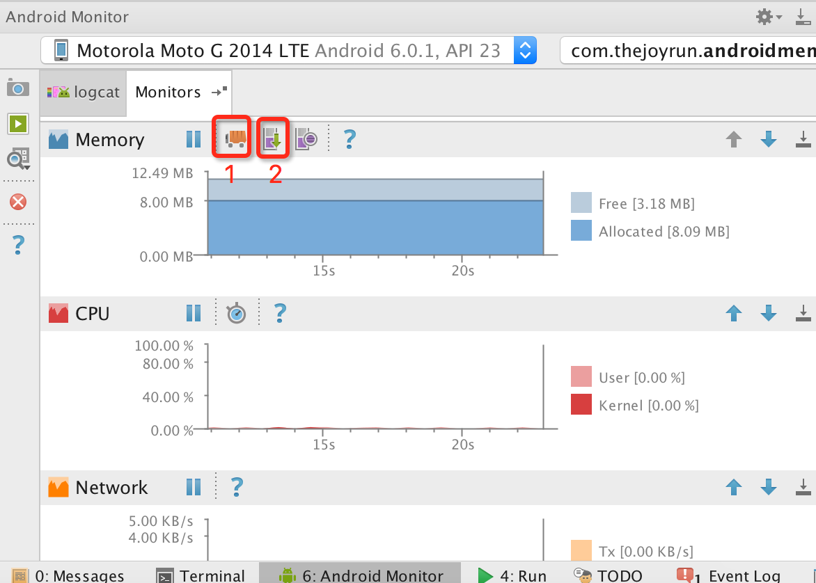 利用Android Studio、MAT對Android進行內存洩漏檢測
Android開發中難免會遇到各種內存洩漏,如果不及時發現處理,會導致出現內存越用越大,可能會因為內存洩漏導致出現各種奇怪的crash,甚至可能出現因內存不足而導致APP
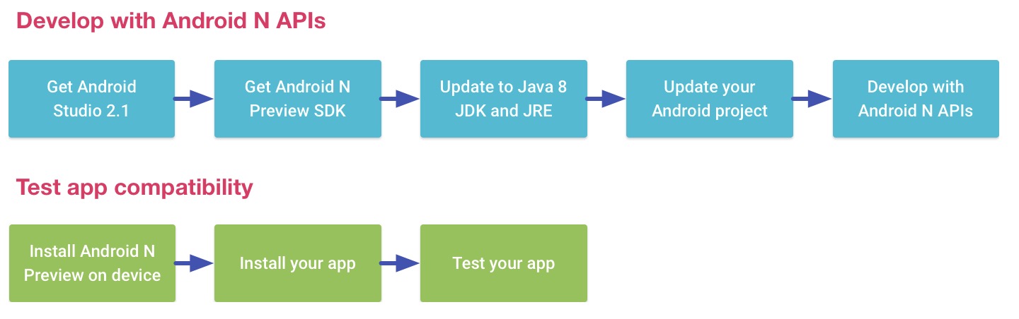 Android N開發
一、前言如果你英文不錯建議你去官網看,官網底部也有翻譯語言選擇。官網地址:http://developer.android.com/preview/api-overvie
 Android仿新聞頂部導航標簽切換效果
最近由於個人興趣原因,寫了個模仿新聞頂部導航標簽的demo。具體看下圖。那麼大致上我們會用到這些知識。1.Fragment2.FragmentPagerAdapter3.