編輯:關於Android編程
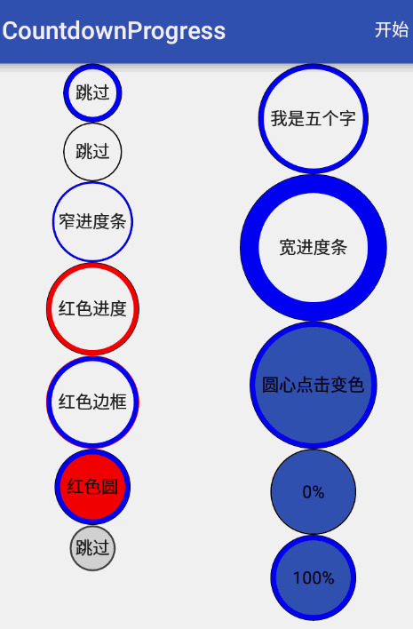
效果預覽
源代碼傳送門:https://github.com/yanzhenjie/CircleTextProgressbar
實現與原理
這個文字圓形的進度條我們在很多APP中看到過,比如APP歡迎頁倒計時,下載文件倒計時等。
分析下原理,可能有的同學一看到這個自定義View就慌了,這個是不是要繼承View啊,是不是要繪制啊之類的,答案是:是的。但是我們也不要擔心,實現這個效果實在是so easy。下面就跟我一起來看看核心分析和代碼吧。
原理分析
首先我們觀察上圖,需要幾個部分組成:
1. 外面逐漸增加/減少的圓形進度條。
2. 圓形進度條中間的展示文字。
3. 圓形進度條外面包裹的圓。
4. 圓形進度條中間的填充色。
5. 字體顏色/填充顏色點擊變色:ColorStateList類。
我們分析得出需要四個部分。一看有文字,那麼第一個想到的自然是TextView啦,正好可以少做一個字體顏色的記錄。中間的填充顏色(原型暫且不考慮)點擊時變色,需要ColorStateList類來記錄。剩下的進度條、輪廓圓和填充圓是需要我們繪制的。
我封裝的CircleTextProgressbar特色
CircleTextProgressbar支持自動倒計時,自動減少進度,自動增加進度等。
如果需要自動走進度的話,設置完你自定義的屬性後調用start()方法就可以自動倒計時了,如果想走完後再走一遍自動進度調用一下reStart()就OK了。
如果不想自動走進度,你可以通過setProgress()來像系統的progress一樣修改進度值。
// 和系統普通進度條一樣,0-100。
progressBar.setProgressType(CircleTextProgressbar.ProgressType.COUNT);
// 改變進度條。
progressBar.setProgressLineWidth(30);// 進度條寬度。
// 設置倒計時時間毫秒,默認3000毫秒。
progressBar.setTimeMillis(3500);
// 改變進度條顏色。
progressBar.setProgressColor(Color.RED);
// 改變外部邊框顏色。
progressBar.setOutLineColor(Color.RED);
// 改變圓心顏色。
progressBar.setInCircleColor(Color.RED);
// 如果需要自動倒計時,就會自動走進度。
progressBar.start();
// 如果想自己設置進度,比如100。
progressBar.setProgress(100);
踩坑的過程
其實好久沒有寫過自定義View了,有些東西還真忘記了,所以寫這個View的時候又把之前的坑踩了一遍,為了避免其它同學也被坑,這裡把我踩的坑也記錄下。
View繪制區域
這裡我遇到一個問題,因為我們繼承的TextView文字多了就是長的,那麼繪制出來的圓長寬是一樣的,所以在TextView上繪制出來的圓只能看到一部分或者是橢圓的。所以我們要把View的繪制區域擴大。當時我第一個想到的是layout()方法,因為當View的父布局onLayout()的時候會調用View的layout()來讓子View布局,我重寫了layout方法:
@Override
public void layout(int left, int top, int right, int bottom) {
 int w = right - left;
 int h = bottom - top;
 int size = w > h ? w : h;

 if (w > h) {
  bottom += (size - h);
 } else {
  right += (size - w);
 }
 super.layout(left, top, right, bottom);
}
這段代碼的原理就是寬和高,那個大,就把view擴大到這麼最大的這個值。
當放了一個View在Layout時,效果出來沒問題,但是我放多個View到LinearLayout中的時候發現幾個View重疊了,哦捨特。我恍然大悟啊,這尼瑪人家Layout已經把我繪制區域的寬高指定了,我強行去占領別的View的了。so,我應該重寫onMeasure()啊,在測量寬高的時候就告訴父Layout我要多大的地盤:
@Override
protected void onMeasure(int widthMeasureSpec, int heightMeasureSpec) {
 super.onMeasure(widthMeasureSpec, heightMeasureSpec);
 int width = getMeasuredWidth();
 int height = getMeasuredHeight();
 int size = width > height ? width : height;
 setMeasuredDimension(size, size);
}
這段代碼的意思更容易理解,就是看super.onMeasure測量的時候的寬高哪個大,就把寬高都設置成最大的這個值。告訴父Layout我要多大的地盤,那麼等我繪制的時候我想怎麼玩就怎麼玩。
繪制View的實現
好了,來到了關鍵的地方,前面的都搞定了就看我們怎麼繪制我們的幾個圓圈圈了。畫圓圈圈就要重寫onDraw()方法啦。
首先需要一個畫筆:
Paint mPaint = new Paint();
mPaint.setAntiAlias(true);// 抗鋸齒
拿到繪制區域
我們可以通過getDrawingRect(Rect)獲取到繪制區域,通過繪制區域計算出這個區域可以繪制圓的半徑。
Rect bounds = new Rect();

@Override
protected void onDraw(Canvas canvas) {
 getDrawingRect(bounds);//獲取view的邊界

 int size = bounds.height() > bounds.width() ? bounds.width() : bounds.height();
 float outerRadius = size / 2; // 計算出繪制圓的半徑
}
繪制填充圓
那麼剛才提到過點擊的時候變色,所以我們要用到ColorStateList,這裡做一個初始化,並且支持在xml中定義這個屬性:
// 默認透明填充。
ColorStateList inCircleColors = ColorStateList.valueOf(Color.TRANSPARENT);

private void initialize(Context ctx, AttributeSet attributeSet) {
 TypedArray typedArray = ctx.obtainStyledAttributes(attributeSet, R.styleable.Progressbar);
 inCircleColors = typedArray.getColorStateList(R.styleable.Progressbar_circle_color);
 typedArray.recycle();
}
不明白如何自定View xml屬性的同學請求自行Google。
根據點擊、Check、Select狀態繪制填充圓的顏色,因為是填充,所以這裡Paint的Style是FILL:
int circleColor = inCircleColors.getColorForState(getDrawableState(), 0);
mPaint.setStyle(Paint.Style.FILL);
mPaint.setColor(circleColor);
canvas.drawCircle(bounds.centerX(), bounds.centerY(), outerRadius - outLineWidth, mPaint);
圓心是繪制區域的圓心,半徑是繪制區域圓的半徑減去外部輪廓圓線的寬度。這樣正好填充圓和外部輪廓圓不重疊。
繪制外部邊框圓
這個就簡單了,因為是空心的線,所以Style是STROKE,然後設置線的寬度,畫筆的顏色:
mPaint.setStyle(Paint.Style.STROKE);
mPaint.setStrokeWidth(outLineWidth);
mPaint.setColor(outLineColor);
canvas.drawCircle(bounds.centerX(), bounds.centerY(), outerRadius - outLineWidth / 2, mPaint);
圓心是繪制區域的圓心,半徑是繪制區域圓的半徑減去外部輪廓圓線的寬度的一半,這樣剛好外部輪廓線和內部填充圓緊靠著。
繪制TextView的字
為了我們的繪制和TextView自身的繪制不重疊,我們干掉了super.onDraw(canvas);,所以這裡我們要把TextView的字也要寫上去。
首先拿到TextView的默認畫筆,設置TextView本身的字體顏色,抗鋸齒,為了美觀我們強行讓文字居中:
//畫字
Paint paint = getPaint();
paint.setColor(getCurrentTextColor());
paint.setAntiAlias(true);
paint.setTextAlign(Paint.Align.CENTER);
float textY = bounds.centerY() - (paint.descent() + paint.ascent()) / 2;
canvas.drawText(getText().toString(), bounds.centerX(), textY, paint);
繪制進度條
進度條可不是一個圓了喔,准確的說它是一個圓弧,
畫筆使用默認畫筆,設置顏色、Style為STROKE,設置線的寬度,最後是指定繪制區域和圓心,角度:
RectF mArcRect = new RectF();
Rect bounds = new Rect();

@Override
protected void onDraw(Canvas canvas) {
 getDrawingRect(bounds);//獲取view的邊界
 ...

 // 繪制進度條圓弧。
 mPaint.setColor(progressLineColor);
 mPaint.setStyle(Paint.Style.STROKE);
 mPaint.setStrokeWidth(progressLineWidth);
 mPaint.setStrokeCap(Paint.Cap.ROUND);
 int deleteWidth = progressLineWidth + outLineWidth;
 // 指定繪制區域
 mArcRect.set(bounds.left + deleteWidth / 2, bounds.top + deleteWidth / 2,
 bounds.right -deleteWidth / 2, bounds.bottom - deleteWidth / 2);
 canvas.drawArc(mArcRect, 0, 360 * progress / 100, false, mPaint);
}
這裡難點在指定繪制區域,因為不能把外部輪廓線覆蓋了,所以要貼近外部輪廓線的內部畫,所以要最外層繪制圓的區域,所以要減去(外部圓線的寬 + 進度條線的寬) / 2得出來的界線就是進度條的邊界。
繪制和測量的完整代碼
到這裡關鍵代碼都撸完了,你可以自己寫一個試試了,我這裡把完整的onDraw()和onMeasure()的源碼貼出來:
private int outLineColor = Color.BLACK;
private int outLineWidth = 2;
private ColorStateList inCircleColors = ColorStateList.valueOf(Color.TRANSPARENT);
private int circleColor;
private int progressLineColor = Color.BLUE;
private int progressLineWidth = 8;
private Paint mPaint = new Paint();
private RectF mArcRect = new RectF();
private int progress = 100;
final Rect bounds = new Rect();

@Override
protected void onDraw(Canvas canvas) {
 //獲取view的邊界
 getDrawingRect(bounds);

 int size = bounds.height() > bounds.width() ? bounds.width() : bounds.height();
 float outerRadius = size / 2;

  //畫內部背景
 int circleColor = inCircleColors.getColorForState(getDrawableState(), 0);
 mPaint.setStyle(Paint.Style.FILL);
 mPaint.setColor(circleColor);
 canvas.drawCircle(bounds.centerX(), bounds.centerY(), outerRadius - outLineWidth, mPaint);

 //畫邊框圓
 mPaint.setStyle(Paint.Style.STROKE);
 mPaint.setStrokeWidth(outLineWidth);
 mPaint.setColor(outLineColor);
 canvas.drawCircle(bounds.centerX(), bounds.centerY(), outerRadius - outLineWidth / 2, mPaint);

 //畫字
 Paint paint = getPaint();
 paint.setColor(getCurrentTextColor());
 paint.setAntiAlias(true);
 paint.setTextAlign(Paint.Align.CENTER);
 float textY = bounds.centerY() - (paint.descent() + paint.ascent()) / 2;
 canvas.drawText(getText().toString(), bounds.centerX(), textY, paint);

 //畫進度條
 mPaint.setColor(progressLineColor);
 mPaint.setStyle(Paint.Style.STROKE);
 mPaint.setStrokeWidth(progressLineWidth);
 mPaint.setStrokeCap(Paint.Cap.ROUND);
 int deleteWidth = progressLineWidth + outLineWidth;
 mArcRect.set(bounds.left + deleteWidth / 2, bounds.top + deleteWidth / 2,
 bounds.right - deleteWidth / 2, bounds.bottom - deleteWidth / 2);

 canvas.drawArc(mArcRect, 0, 360 * progress / 100, false, mPaint);
}

@Override
protected void onMeasure(int widthMeasureSpec, int heightMeasureSpec) {
 super.onMeasure(widthMeasureSpec, heightMeasureSpec);
 int lineWidth = 4 * (outLineWidth + progressLineWidth);
 int width = getMeasuredWidth();
 int height = getMeasuredHeight();
 int size = (width > height ? width : height) + lineWidth;
 setMeasuredDimension(size, size);
}
目前已知的兼容問題修復
1.目前CircleTextProgressbar在ReletiveLayot中高度會變大,導致進度條會有一點點扁。修復方法如下:
如果你要在ReletiveLayot中使用CircleTextProgressbar,就不要重寫onMeasure()方法,然後在xml中指定CircleTextProgressbar的寬高就好,比如都指定為50dp,然後就沒有問題啦。
以上就是本文的全部內容,希望對大家的學習有所幫助,也希望大家多多支持本站。
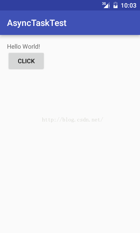 Android利用異步任務AsyncTask發送post請求獲取json數據
AsyncTask,是android提供的輕量級的異步類,可以直接繼承AsyncTask,在類中實現異步操作,並提供接口反饋當前異步執行的程度(可以通過接口實現UI進度更
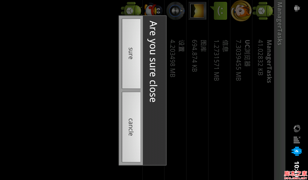 android實現獲取正在運行的應用程序
因為在framework中想添加這個功能,所以寫了個appliction來實現一下獲取正在運行的應用程序: 還是先看圖吧: 這個app主要是簡單的實現了獲取非系統的應用程
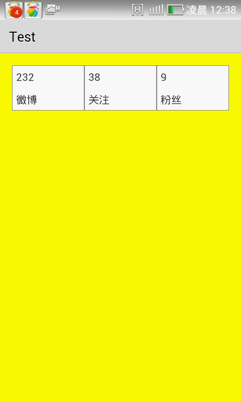 Android實現給TableLayou繪制邊框的方法
本文實例講述了Android實現給TableLayou繪制邊框的方法。分享給大家供大家參考,具體如下:效果如下:思路:使用share作為背景顯示邊框步驟:1.在res/d
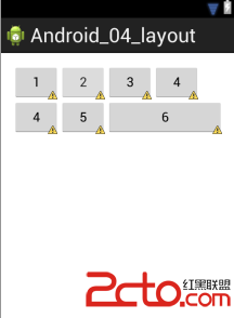 android界面設計之布局
一、線性布局