編輯:關於Android編程
Android 自定義view實現動態進度條
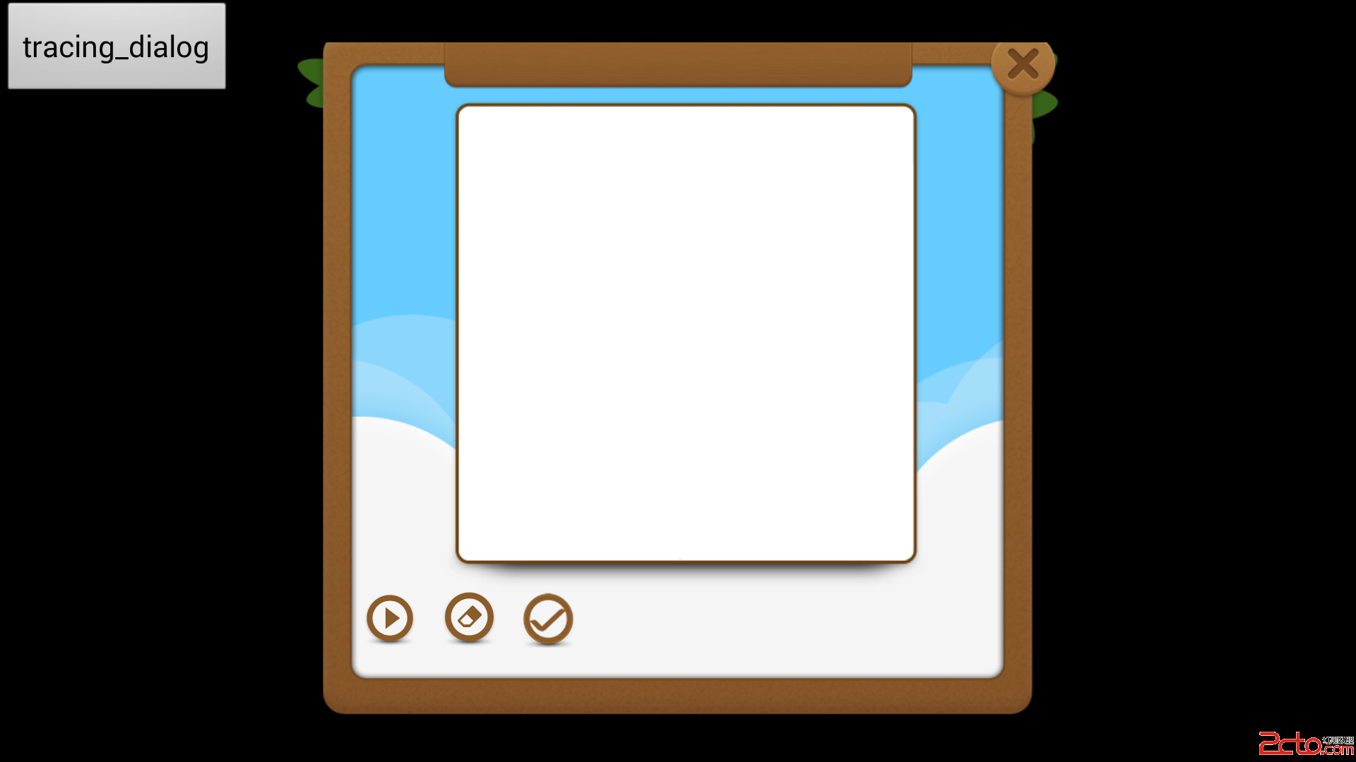
效果圖:
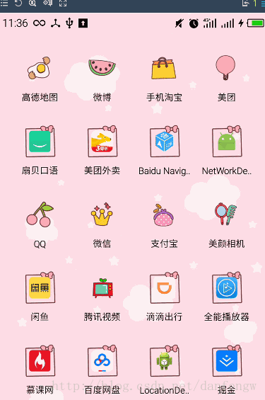
這個是看了梁肖的demo,根據他的思路自己寫了一個,但是我寫的這個貌似計算還是有些問題,從上面的圖就可以看出來,左側、頂部、右側的線會有被截掉的部分,有懂得希望能給說一下,改進一下,這個過程還是有點曲折的,不過還是覺得收獲挺多的。比如通動畫來進行動態的展示(之前做的都是通過Handler進行更新的所以現在換一種思路覺得特別好),還有圓弧的起止角度,矩形區域的計算等!關於繪制我們可以循序漸進,比如最開始先畫圓,然後再畫周圍的線,最後設置動畫部分就可以了。不多說了,上代碼了。
代碼
自定義View
public class ColorProgressBar extends View{
//下面這兩行在本demo中沒什麼用,只是前幾天看別人的代碼時學到的按一定尺寸,設置其他尺寸的方式,自動忽略或者學習一下也不錯
// private int defaultStepIndicatorNum= (int) TypedValue.applyDimension(TypedValue.COMPLEX_UNIT_DIP,40,getResources().getDisplayMetrics());
// int mCircleRadius=0.28f*defaultStepIndicatorNum;
//布局的寬高
private int mWidth;
private int mHeight;
//直徑
private int mDiameter=500;
//底層圓畫筆
private Paint mPaintbg;
//頂層圓的畫筆
private Paint mPaintft;
//周圍線的畫筆
private Paint mPaintLine;
//外層線條的長度
private int mLongItem=dip2px(20);
//線條與圓的間距
private int mDistanceItem=dip2px(10);
//進度條的最大寬度(取底層進度條與頂層進度條寬度最大的)
private int mProgressWidth;
//底層圓的顏色
private int mBackColor;
//頂層圓的顏色
private int mFrontColor;
//底層圓、頂層圓的寬度
private float mBackWidth;
private float mFrontWidth;
//設置進度
private float currentvalue;
//通過動畫演示進度
private ValueAnimator animator;
private int curvalue;
public ColorProgressBar(Context context) {
this(context,null,0);
}
public ColorProgressBar(Context context, AttributeSet attrs) {
this(context, attrs,0);
}
public ColorProgressBar(Context context, AttributeSet attrs, int defStyleAttr) {
super(context, attrs, defStyleAttr);
TypedArray ta=context.obtainStyledAttributes(attrs, R.styleable.ColorProgressBar);
mBackColor= ta.getColor(R.styleable.ColorProgressBar_back_color, Color.BLACK);
mFrontColor=ta.getColor(R.styleable.ColorProgressBar_front_color,mBackColor);
mBackWidth=ta.getDimension(R.styleable.ColorProgressBar_back_width,dip2px(10));
mFrontWidth=ta.getDimension(R.styleable.ColorProgressBar_front_width,dip2px(10));
mProgressWidth=mBackWidth>mFrontWidth?(int)mBackWidth:(int)mFrontWidth;
//注意釋放資源
ta.recycle();
init();
}
/**
* 都是畫筆初始化
*/
private void init() {
mPaintbg=new Paint(Paint.ANTI_ALIAS_FLAG);
mPaintbg.setStrokeWidth(mProgressWidth);
mPaintbg.setColor(mBackColor);
mPaintbg.setStrokeCap(Paint.Cap.ROUND);
mPaintbg.setStyle(Paint.Style.STROKE);
mPaintft=new Paint(Paint.ANTI_ALIAS_FLAG);
mPaintft.setColor(mFrontColor);
mPaintft.setStyle(Paint.Style.STROKE);
mPaintft.setStrokeWidth(mFrontWidth);
mPaintft.setStrokeCap(Paint.Cap.ROUND);
mPaintLine=new Paint(Paint.ANTI_ALIAS_FLAG);
mPaintLine.setColor(Color.BLACK);
mPaintLine.setStrokeWidth(5);
}
@Override
protected void onMeasure(int widthMeasureSpec, int heightMeasureSpec) {
super.onMeasure(widthMeasureSpec, heightMeasureSpec);
// 寬度=高度=(長指針+指針與圓盤的間距+進度條的粗細+半徑)*2
Log.e("測量數據","LongItem:"+mLongItem+"mDistanceItem:"+mDistanceItem+"mProgressWidth:"+mProgressWidth+"mDiameter:"+mDiameter/2);
mWidth=(int)2*(mLongItem+mDistanceItem+mProgressWidth*2+mDiameter/2);
mHeight=(int)2*(mLongItem+mDistanceItem+mProgressWidth*2+mDiameter/2);
Log.e("自定義View","高度"+mHeight+"寬度"+mWidth);
setMeasuredDimension(mWidth,mHeight);
}
@Override
protected void onDraw(Canvas canvas) {
super.onDraw(canvas);
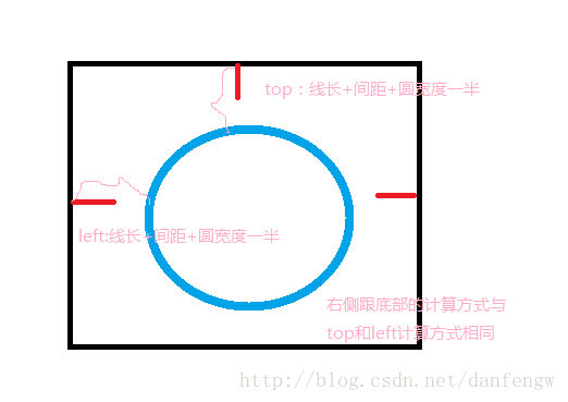
//繪制底層圓弧,矩形的具體計算見圖片
canvas.drawArc(new RectF(mProgressWidth/2+mDistanceItem+mLongItem,mProgressWidth/2+mDistanceItem+mLongItem,mWidth-mProgressWidth/2-mDistanceItem-mLongItem,mHeight-mProgressWidth/2-mDistanceItem-mLongItem),0,360,true,mPaintbg);
// SweepGradient gradient=new SweepGradient();
//繪制邊緣線
canvas.save();
canvas.rotate(144,mWidth/2,mHeight/2);
for(int i=0;i<=30;i++){
canvas.rotate(-9,mWidth/2,mHeight/2);
if(i%5==0){
canvas.drawLine(mWidth/2,5,mWidth/2,mLongItem,mPaintbg);
}else {
canvas.drawLine(mWidth/2,25,mWidth/2,mLongItem,mPaintLine);
}
}
canvas.restore();
//給畫筆設置漸變
SweepGradient sweepGradient=new SweepGradient(mWidth/2,mHeight/2,Color.RED,Color.YELLOW);
mPaintft.setShader(sweepGradient);
//繪制頂層圓弧,currentvalue在改變時呈現動態效果
canvas.drawArc(new RectF(mProgressWidth/2+mDistanceItem+mLongItem,mProgressWidth/2+mDistanceItem+mLongItem,mWidth-mProgressWidth/2-mDistanceItem-mLongItem,mHeight-mProgressWidth/2-mDistanceItem-mLongItem),135,currentvalue,false,mPaintft);
mPaintft.setTextSize(100);
mPaintft.setTextAlign(Paint.Align.CENTER);
//繪制文本
canvas.drawText(String.format("%.0f",currentvalue),mWidth/2,mHeight/2+50,mPaintft);
invalidate();
}
/**
* 設置動畫
* @param value
*/
public void setCurrentValue(float value){
// currentvalue=value;
animator=ValueAnimator.ofFloat(currentvalue,value);
animator.setDuration(3000);
animator.setTarget(currentvalue);
animator.addUpdateListener(new ValueAnimator.AnimatorUpdateListener() {
@Override
public void onAnimationUpdate(ValueAnimator valueAnimator) {
currentvalue= (float) valueAnimator.getAnimatedValue();
curvalue=curvalue/10;
}
});
animator.start();
}
private int dip2px(float dip){
float density=getContext().getResources().getDisplayMetrics().density;
return (int)(dip*density+0.5f);
}
}
矩形計算
Activity調用
 @Override
  protected void onCreate(@Nullable Bundle savedInstanceState) {
    super.onCreate(savedInstanceState);
    setContentView(R.layout.colorprogressbar);
    mBtStart1= (Button) findViewById(R.id.bt1);

    bar1= (ColorProgressBar) findViewById(R.id.cp1);

    mBtStart1.setOnClickListener(new View.OnClickListener() {
      @Override
      public void onClick(View view) {
        bar1.setCurrentValue(270);
      }
    });

  }
自定義屬性
 <declare-styleable name="ColorProgressBar">
    <attr name="back_color" format="color"></attr>
    <attr name="front_color" format="color"></attr>
    <attr name="back_width" format="dimension"></attr>
    <attr name="front_width" format="dimension"></attr>
  </declare-styleable>
布局
注意:為了使用自定義屬性需要添加一行代碼(AS)
xmlns:app=http://schemas.android.com/apk/res-auto
布局
<LinearLayout
 xmlns:android="http://schemas.android.com/apk/res/android"
  xmlns:app="http://schemas.android.com/apk/res-auto"
    android:layout_width="match_parent"
    android:layout_height="wrap_content"
    android:orientation="vertical">
    <Button
      android:id="@+id/bt1"
      android:layout_width="wrap_content"
      android:layout_height="wrap_content"
      android:text="start1"/>

    <com.demo.demo.networkdemo.colorprogressbar.widget.ColorProgressBar
      android:id="@+id/cp1"
      android:layout_width="232dp"
      android:layout_height="match_parent"
      android:layout_gravity="center_horizontal"
      app:back_color="@color/colorPrimary"
      app:front_color="@color/colorAccent"
      android:background="@mipmap/ic_launcher"/>


  </LinearLayout>
感謝閱讀,希望能幫助到大家,謝謝大家對本站的支持!
 Android setContentView()源碼解析
前言在Activity中一般第一句就是調用setContentView(R.layout.XXX),但這其中系統做了那些工作?我們知道,在ClassLoader裝載了Ma
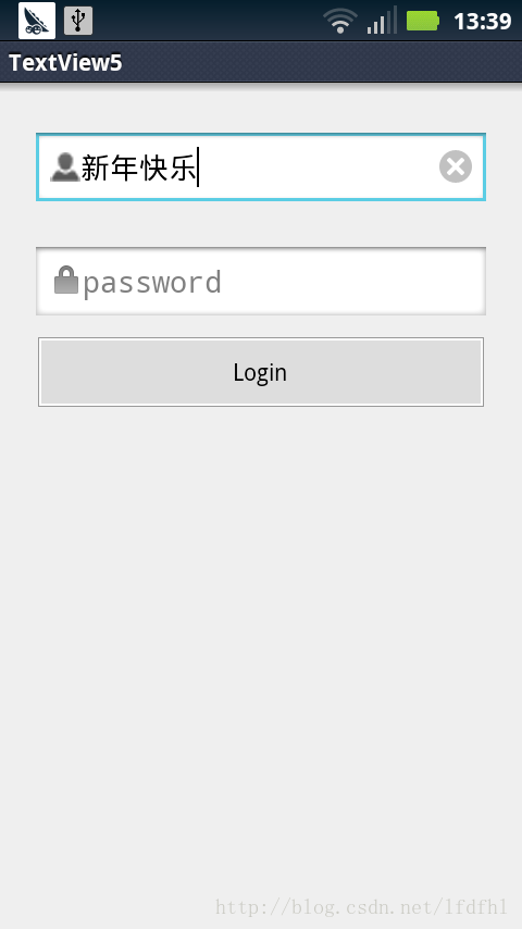 Android 帶有刪除按鈕的EditText
MainActivity如下:package cc.textview5; import android.os.Bundle; import android.text.Te
 Android學習筆記(十八)——使用意圖篩選器和實現浏覽網頁(附源碼)
使用意圖篩選器 點擊下載源碼 1、創建一個Intents項目,給該項目添加一個新類,命名為MyBrowserActivity,在res/layout文件夾下
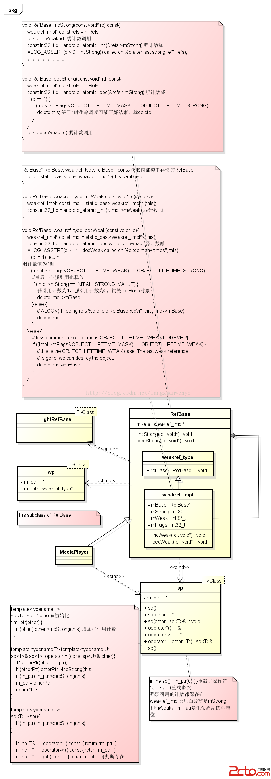 Android framework回顧 sp 和 wp sp對象
用MediaPlayer說明sp的實現。sp是一個模板類,T是RefBase的子類。只要繼承於RefBase的類都可以使用sp。binder類也繼承RefBase類,bi