編輯:Android開發實例
今天還是來講下Tab的實現。android自帶的Tab在有比較多條目的時候會顯得非常擠,這樣不僅不美觀,更加影響操作。如果Tab能做成左右滑動的,那就非常好了。其實實現這種效果並不難,而且方法也不少。今天給大家介紹下用gallery這個組件來實現的方法。
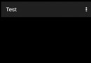
首先我們需要寫Gallery的適配器。這裡我們要注意的是Gallery有一個特點,就是起始一個元素的左邊會留下一塊空位,如下圖所示:
這樣我們的Tab顯然不是很完美,如何解決?開始想的就是去看gallery的源碼,重寫他。不過既然我們做的是滑動的,讓他左右都可滑動不就ok了?要實現左右滑動,要做的事情就是讓裡面的元素循環。Gallery是即時顯示圖像的,可以通過兩點來做到:
1.讓getCount()方法返回一個非常大的值。
2.在getView()中顯示的時候通過循環取余來實現一直顯示數組中的有限值。
而且Gallery還提供了一個setSelection()方法,用來設置當前選擇的條目,我們將顯示的位置放在比較靠後的位置,這樣就不會在左滑的時候滑到頭,那樣就可以以假亂真了。
下面來看下適配器代碼:
 1 public class TabAdapter extends BaseAdapter {
 2         private Context mContext;
 3         private List<String> mList;
 4         private int mSelectedTab;
 5
 6         public TabAdapter(Context context, List<String> list) {
 7             mContext = context;
 8           /*使用attrs裡的 <declare-styleable>屬性*/
 9             TypedArray a = obtainStyledAttributes(R.styleable.Gallery);
10             a.recycle();//重復使用對象的styleable屬性
11              if (list == null)
12                 list = Collections.emptyList();
13             mList = list;
14         }
15         /*
16          * 設置選中的Tab,並且刷新界面
17          */
18         public void setSelectedTab(int tab) {
19             if (tab != mSelectedTab) {
20                 mSelectedTab = tab;
21                 notifyDataSetChanged();
22             }
23         }
24
25         public int getSelectedTab() {
26             return mSelectedTab;
27         }
28
29         public int getCount() {
30             return  Integer.MAX_VALUE;//返回最大值
31          }
32
33         public Object getItem(int position) {
34             return mList.get(position);
35         }
36
37         public long getItemId(int position) {
38             return position;
39         }
40
41         public View getView(int position, View convertView, ViewGroup parent) {
42             TextView text = null;//這裡只放一個TextView,可以根據需要來定制
43              if (convertView == null ) {
44                  text = new TextView(mContext);
45             } else {
46                 text = (TextView) convertView;
47             }
48
49             text.setTextColor(Color.WHITE);
50             text.setText(mList.get(position % mList.size()));//循環取余設置顯示內容
51
52             text.setLayoutParams(new Gallery.LayoutParams(102, 40));
53             text.setGravity(Gravity.CENTER);
54
55             /*
56              * 對於選中的Tab,給他一個選中的背景
57              */
58             if (position == mSelectedTab)
59                 text.setBackgroundResource(R.drawable.tab_button_select);
60             else
61                 text.setBackgroundResource(R.drawable.tab_button_unselect);
62
63             return text;
64         }
65     }
注釋已經寫的很清楚了,應該沒什麼問題。
這裡程序中使用了
TypedArray a = obtainStyledAttributes(R.styleable.Gallery);
            a.recycle();//重復使用對象的styleable屬性
這是一個引用自制layout 元素的用法,必須在res/values 下面添加一個attrs.xml,並在其中定義 <declare-styleable> 標簽TAG,目的是自定義layout 的背景風格,並且通過TypeArray 的特性,讓相同的Layout 元素可以重復用於每一張圖片,大家可以看下apiDemos裡gallery1s的用法,這裡也是參考它的用法。看下attrs.xml的代碼:
<?xml version="1.0" encoding="utf-8"?>
<resources>
    <declare-styleable name="Gallery">
        <attr name="android:galleryItemBackground" />
    </declare-styleable>
</resources>
還要說一點的是,對於選中和未選中的背景處理。我們在onItemClick中得到選中的Tab,然後為選中的和未選中的設置一個背景。這個背景這裡用自定義圖形shape的方法來定義,在res/drawable下新建xml文件,tab_button_select.xml中內容如下:
1 <?xml version="1.0" encoding="utf-8"?>
2 <shape xmlns:android="http://schemas.android.com/apk/res/android">
3     <gradient android:startColor="#FFA2A2A2" android:endColor="#FF5F5F5F"
4         android:angle="90.0">
5     </gradient>
6 </shape>
其中的gradient標簽實現一個從startColor到endColor角度為90漸變色。其實我們經常用這種方式來自定義我們的控件,可以用來實現圓角,漸變,描邊等效果,分別在shape根節點下用gradient,corners,stroke標簽實現,大家可以自己去試試,效果還是很好的,也很簡單。
下面來看下MainActivity的代碼,顯示layout的方法和我以前一篇仿Iphone效果的Tab中一樣,通過隱藏和顯示相應的layout來實現。當然,也可以通過intent來指向不同的Activity等方法來做。注意定義要顯示的Tab數組的時候,因為我們第一個顯示的不是第一個Tab,所以適當調整下數組的定義順序,同樣對應的layou也是。
 1 public class MainActivity extends Activity {
 2
 3     private Gallery gallery;
 4     private TabAdapter textAdapter;
 5
 6     private static final String[] TAB_NAMES = {
 7
 8         "第四個",
 9         "第一個",
10         "第二個",
11         "第三個",
12     };
13
14     private LinearLayout     mTabLayout_One;
15     private LinearLayout     mTabLayout_Two;
16     private LinearLayout     mTabLayout_Three;
17     private LinearLayout     mTabLayout_Four;
18
19     @Override
20     public void onCreate(Bundle savedInstanceState) {
21         super.onCreate(savedInstanceState);
22         setContentView(R.layout.main);
23
24         gallery = (Gallery) findViewById(R.id.gallery);
25         textAdapter = new TabAdapter(this, Arrays.asList(TAB_NAMES));
26         gallery.setAdapter(textAdapter);
27         gallery.setSelection(34);//這裡根據你的Tab數自己算一下,讓左邊的稍微多一點,不要一滑就滑到頭
28
29         mTabLayout_One = (LinearLayout) this.findViewById( R.id.TabLayout_One );
30         mTabLayout_Two = (LinearLayout) this.findViewById( R.id.TabLayout_Two );
31         mTabLayout_Three = (LinearLayout) this.findViewById( R.id.TabLayout_Three );
32         mTabLayout_Four = (LinearLayout) this.findViewById( R.id.TabLayout_Four );
33
34         mTabLayout_One.setVisibility( View.GONE );
35         mTabLayout_Two.setVisibility( View.VISIBLE );
36         mTabLayout_Three.setVisibility( View.GONE );
37         mTabLayout_Four.setVisibility( View.GONE );
38
39         gallery.setOnItemClickListener(new OnItemClickListener() {
40
41             @Override
42             public void onItemClick(AdapterView<?> parent, View view, int position,
43                     long id) {
44                 TabAdapter adapter = (TabAdapter)parent.getAdapter();
45                 adapter.setSelectedTab(position);
46                 switch(position %TAB_NAMES.length ){
47                 case 0:
48                     mTabLayout_One.setVisibility( View.VISIBLE );
49                     mTabLayout_Two.setVisibility( View.GONE );
50                     mTabLayout_Three.setVisibility( View.GONE );
51                     mTabLayout_Four.setVisibility( View.GONE );
52                     break;
53                 case 1:
54                     mTabLayout_One.setVisibility( View.GONE );
55                     mTabLayout_Two.setVisibility( View.VISIBLE );
56                     mTabLayout_Three.setVisibility( View.GONE );
57                     mTabLayout_Four.setVisibility( View.GONE );
58                     break;
59                 case 2:
60                     mTabLayout_One.setVisibility( View.GONE );
61                     mTabLayout_Two.setVisibility( View.GONE );
62                     mTabLayout_Three.setVisibility( View.VISIBLE );
63                     mTabLayout_Four.setVisibility( View.GONE );
64                     break;
65                 case 3:
66                     mTabLayout_One.setVisibility( View.GONE );
67                     mTabLayout_Two.setVisibility( View.GONE );
68                     mTabLayout_Three.setVisibility( View.GONE );
69                     mTabLayout_Four.setVisibility( View.VISIBLE );
70                 }
71
72             }
73
74         });
75
76     }
77 }
最後就是main.xml布局文件了:
<?xml version="1.0" encoding="utf-8"?>
<RelativeLayout xmlns:android="http://schemas.android.com/apk/res/android"
    android:orientation="vertical" android:layout_width="fill_parent"
    android:layout_height="fill_parent"
    android:background="#C5CCD4FF">
    <LinearLayout
            android:id = "@+id/TabLayout_One"
            android:layout_width = "fill_parent"
            android:layout_height = "fill_parent"
            android:layout_below = "@+id/gallery"
            >
            <ScrollView android:layout_width="fill_parent" android:layout_height="wrap_content">
                <RelativeLayout
                    android:layout_width = "fill_parent"
                    android:layout_height = "fill_parent"
                    android:visibility = "visible"
                    >
                    <TextView
                        android:textColor="@android:color/black"
                        android:textSize="30sp"
                        android:layout_width = "wrap_content"
                        android:layout_height = "wrap_content"
                        android:text = "這是第四個布局"
                    />
                    </RelativeLayout>
                </ScrollView>
            </LinearLayout>

        <LinearLayout
            android:id = "@+id/TabLayout_Two"
            android:layout_width = "fill_parent"
            android:layout_height = "fill_parent"
            android:layout_below = "@+id/gallery"
            >
            <ScrollView android:layout_width="fill_parent" android:layout_height="wrap_content">
                    <RelativeLayout
                        android:layout_width = "fill_parent"
                        android:layout_height = "fill_parent"
                        android:visibility = "visible"
                        android:layout_above = "@+id/Tabs"
                        >
                        <Button
                            android:layout_width = "wrap_content"
                            android:layout_height = "wrap_content"
                            android:text = "這是第一個布局"
                            android:textSize = "30sp"
                        />
                    </RelativeLayout>
            </ScrollView>
        </LinearLayout>
        <LinearLayout
            android:id = "@+id/TabLayout_Three"
            android:layout_width = "fill_parent"
            android:layout_height = "fill_parent"
            android:layout_below = "@+id/gallery"
            >
            <ScrollView android:layout_width="fill_parent" android:layout_height="wrap_content">
                <RelativeLayout
                    android:layout_width = "fill_parent"
                    android:layout_height = "fill_parent"
                    android:visibility = "visible"
                    android:layout_above = "@+id/Tabs"
                    >
                    <TextView
                        android:layout_width = "fill_parent"
                        android:layout_height = "fill_parent"
                        android:textSize="25sp"
                        android:textColor="#ffffff"
                        android:text="dddddddddddddddddddddddddddddddddddd"
                    />
                </RelativeLayout>
            </ScrollView>
        </LinearLayout>
        <LinearLayout
            android:id = "@+id/TabLayout_Four"
            android:layout_width = "fill_parent"
            android:layout_height = "fill_parent"
            android:layout_below = "@+id/gallery"
            >
            <ScrollView android:layout_width="fill_parent" android:layout_height="wrap_content">
                <RelativeLayout
                    android:id = "@+id/TabLayout_Four"
                    android:layout_width = "fill_parent"
                    android:layout_height = "fill_parent"
                    android:visibility = "visible"
                    android:layout_above = "@+id/Tabs"
                    >
                    <TextView
                        android:textColor="@android:color/black"
                        android:layout_width = "wrap_content"
                        android:layout_height = "wrap_content"
                        android:text = "很簡單,是麼"
                    />
                </RelativeLayout>
            </ScrollView>
        </LinearLayout>
    <Gallery
        android:id="@+id/gallery"
        android:layout_alignParentTop="true"
        android:layout_width="fill_parent"
        android:layout_height="wrap_content"
        android:unselectedAlpha="1"
        android:spacing="1dip"/>
</RelativeLayout>
這樣我們用gallery實現的可滑動的Tab就完成了,看下最後的效果。
大家有什麼問題可以留言交流哈。特別是對讓左邊不留空的方法有好的解決辦法的話,希望能提出來,大家一起學習交流。
 Facebook Android閃光效果開源庫shimmer的用法
shimmer開源庫介紹 Shimmer是Fa
 Android編程之SMS讀取短信並保存到SQLite的方法
本文實例講述了Android編程之SMS讀取短信並保存到SQLite的方法。分享給大家供大家參考,具體如下: Android 之 SMS 短信在Android系統
 Android MediaPlayer(多媒體播放)
Android提供了許多方法來控制播放的音頻/視頻文件和流。其中該方法是通過一類稱為MediaPlayer。Android是提供MediaPlayer類訪問內置的媒體播放
 Android加載Spinner
可以顯示在的Android任務,通過加載進度條的進展。進度條有兩種形狀。加載欄和加載微調(spinner)。在本章中,我們將討論微調(spinner)。Spinner 用