編輯:Android開發實例
最近在寫一個應用,想把設置頁面和應用頁面放在一起,這樣就能實現用戶可以實時看到自己的設置對UI的影響,從而更方便的設置用戶喜歡的界面。想了一段時間,發現用slidingDrawer這個控件可以實現這個效果。也就是一個抽屜。拉開抽屜,占據半個屏幕,另外半個屏幕還是顯示應用頁面。效果還是不錯的。
今天就和大家分享一下android中這個抽屜效果。其實在android的lanucher就是一個抽屜,打開它就可以看到安裝的應用。相信大家都見過用過。下面我們就來做個相同的效果,當然只是UI上差不多相同的效果。
slidingDrawer這個控件使用非常簡單,基本在xml裡面配置就可以。代碼如下所示。
代碼如下:
<?xml version="1.0" encoding="utf-8"?>
<RelativeLayout
xmlns:android="http://schemas.android.com/apk/res/android"
android:layout_width="fill_parent"
android:layout_height="fill_parent"
>
<TextView
android:layout_width="fill_parent"
android:layout_height="wrap_content"
android:text="@string/hello"
android:textSize="20sp"
/>
<SlidingDrawer
android:id="@+id/sd"
android:layout_width="match_parent"
android:layout_height="match_parent"
android:handle="@+id/iv"
android:content="@+id/myContent"
android:orientation="vertical"
>
<ImageView
android:id="@+id/iv"
android:layout_width="wrap_content"
android:layout_height="wrap_content"
android:src="@drawable/open1"
/>
<GridView
android:id="@id/myContent"
android:layout_width="wrap_content"
android:layout_height="wrap_content"
android:numColumns="3"
android:background="@drawable/background"
android:gravity="center"
/>
</SlidingDrawer>
</RelativeLayout>
在SlidingDrawer這個標簽下android:handle:指示的就是抽屜的圖片。android:content:指向的就是抽屜裡面的布局。有了這個布局,其實一個抽屜就出來了。
下面我們看Chouti這個類的代碼
代碼如下:
public class Chouti extends Activity {
private GridView gv;
private SlidingDrawer sd;
private ImageView iv;
private int[] icons={R.drawable.browser,R.drawable.gallery,
R.drawable.camera,R.drawable.gmail,
R.drawable.music,R.drawable.market,
R.drawable.phone,R.drawable.messages,R.drawable.maps};
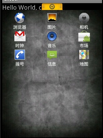
private String[] items={"浏覽器","圖片","相機","時鐘","音樂","市場","撥號","信息","地圖"};
/** Called when the activity is first created. */
@Override
public void onCreate(Bundle savedInstanceState) {
super.onCreate(savedInstanceState);
setContentView(R.layout.main);
gv = (GridView)findViewById(R.id.myContent);
sd = (SlidingDrawer)findViewById(R.id.sd);
iv=(ImageView)findViewById(R.id.iv);
MyAdapter adapter=new MyAdapter(this,items,icons);//自定義MyAdapter來實現圖標加item的顯示效果
gv.setAdapter(adapter);
sd.setOnDrawerOpenListener(new SlidingDrawer.OnDrawerOpenListener()//開抽屜
{
@Override
public void onDrawerOpened()
{
iv.setImageResource(R.drawable.close1);//響應開抽屜事件 ,把圖片設為向下的
}
});
sd.setOnDrawerCloseListener(new SlidingDrawer.OnDrawerCloseListener()
{
@Override
public void onDrawerClosed()
{
iv.setImageResource(R.drawable.open1);//響應關抽屜事件
}
});
}
}
在整個類裡面將布局導入,同時設置開關抽屜的監聽事件。這裡面我們需要自定義一個MyAdapter來顯示帶文字下標的圖片。
下面是MyAdapter這個類的代碼
代碼如下:
public class MyAdapter extends BaseAdapter
{
private Context _ct;
private String[] _items;
private int[] _icons;
public MyAdapter(Context ct,String[] items,int[] icons) //構造器
{
_ct=ct;
_items=items;
_icons=icons;
}
@Override
public int getCount()
{
return _items.length;
}
@Override
public Object getItem(int arg0)
{
return _items[arg0];
}
@Override
public long getItemId(int position)
{
return position;
}
@Override
public View getView(int position, View convertView, ViewGroup parent)
{
LayoutInflater factory = LayoutInflater.from(_ct);
View v = (View) factory.inflate(R.layout.gv, null);//綁定自定義的layout
ImageView iv = (ImageView) v.findViewById(R.id.icon);
TextView tv = (TextView) v.findViewById(R.id.text);
iv.setImageResource(_icons[position]);
tv.setText(_items[position]);
return v;
}
}
也是非常的簡單,其中用到的布局如下
代碼如下:
<?xml version="1.0" encoding="utf-8"?>
<LinearLayout
xmlns:android="http://schemas.android.com/apk/res/android"
android:orientation="vertical"
android:layout_width="fill_parent"
android:layout_height="fill_parent"
>
<ImageView
android:id="@+id/icon"
android:layout_width="wrap_content"
android:layout_height="40px"
android:layout_gravity="center"
/>
<TextView
android:id="@+id/text"
android:layout_width="fill_parent"
android:layout_height="wrap_content"
android:gravity="center"
android:textColor="#ffffffff"
/>
</LinearLayout>
這樣,我們的抽屜就完成啦 來看下效果
就寫這麼多啦。抽屜這個控件非常實用,除了我在開頭所說的我在程序中的應用外,還有很多的用途, 發揮你的想象力,抽屜將為你的應用增色不少。
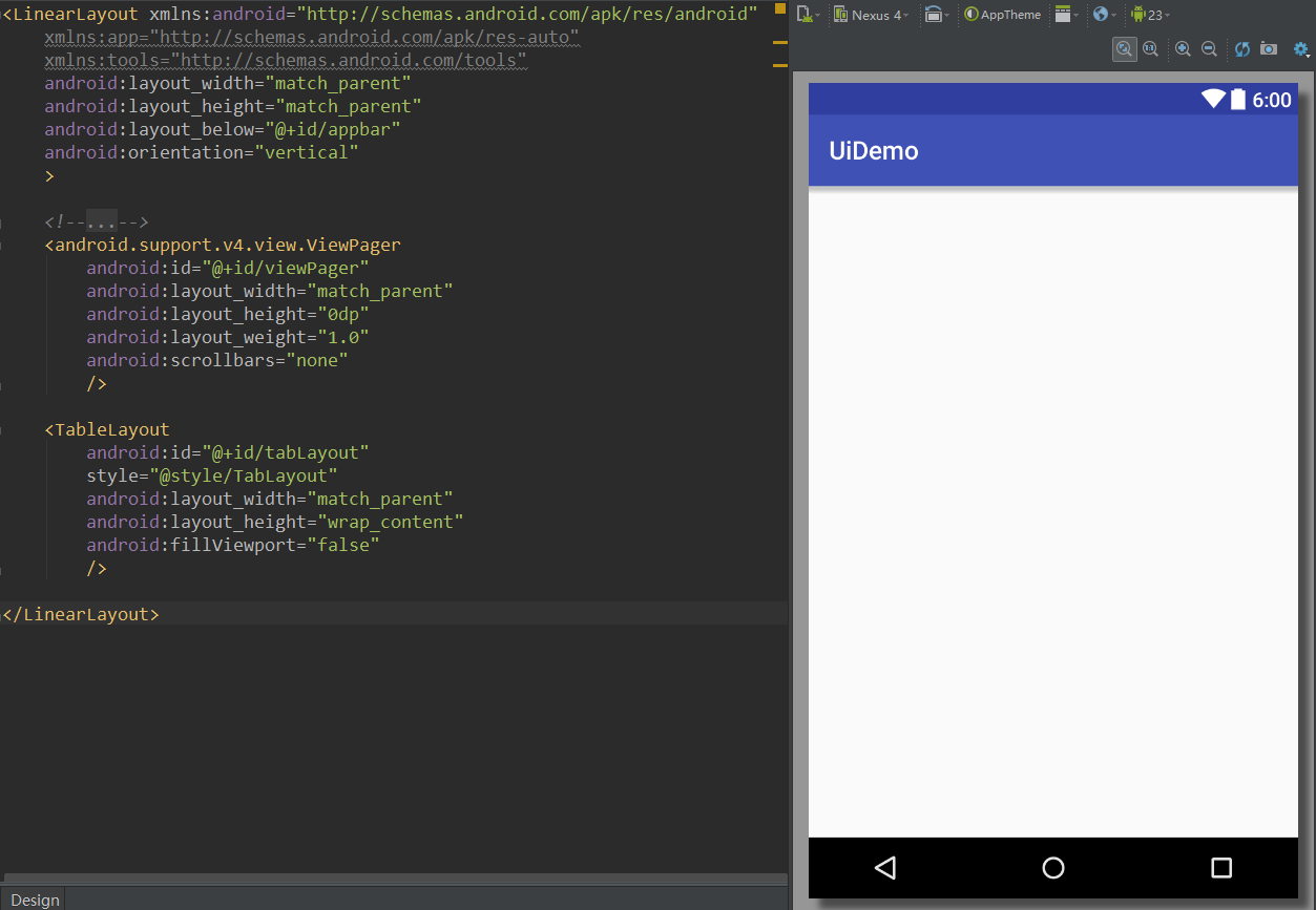 Android UI實時預覽和編寫的各種技巧
一、啰嗦 之前有讀者反饋說,你搞這個所謂的最佳實踐,每篇文章最後就給了一個庫,感覺不是很高大上。其實,我在寫這個系列之初就有想過這個問題。我的目的是:給出最實用
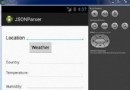 Android JSON解析器
JSON代表JavaScript對象符號。它是一個獨立的數據交換格式,是XML的最佳替代品。本章介紹了如何解析JSON文件,並從中提取所需的信息。Android提供了四個
 Android本地化
Android應用程序可以在許多不同地區的許多設備上運行。為了使應用程序更具交互性,應用程序應該處理以適合應用程序將要使用的語言環境方面的文字,數字,文件等。在本章中,我
 帶你實現開發者頭條(一) 啟動頁實現
對於很多初學者或者剛工作的Android新手來說,我們的項目經驗還停留在做demo的階段,有沒有一種很low的感覺,並且當你真正上手做大項目的時候又