編輯:關於android開發
今天我們一起來看一下工具欄控件ToolBarAndroid的介紹完全解析以及最佳實踐。
剛創建的React Native技術交流群(282693535),歡迎各位大牛,React Native技術愛好者加入交流!同時博客左側歡迎微信掃描關注訂閱號,移動技術干貨,精彩文章技術推送!
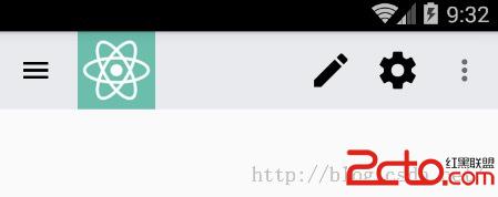
該ToolBarAndroid組件進行封裝了Android平台中的ToolBar組件(只適用於Android平台)。一個ToolBar組件可以顯示一個Logo圖標以及一些導航圖片(例如:菜單功能按鈕),一個標題以及副標題還有一系列功能的列表。標題和副標題是上下位置。所以logo圖標和導航圖標顯示在左邊,標題和副標題顯示在中間,功能列表顯示在右邊。
【注】如果Toolbar只有一個子節點,該會顯示在標題和功能列表中間。
特別聲明:盡管Toolbar的Logo圖標,導航圖標以及功能列表的圖標支持加載遠程的圖片(網絡圖片等)。不過該加載遠程圖片資源只是在Dev(開發模式)模式中支持。但是在Release(發布模式)模式中,你應該只能使用應用中的資源來進行渲染。例如使用request('./some_icon.png')會自動幫我進行加載資源。所以我們在開發中只要不直接使用{uri:'http://...'}就一般沒啥問題啦。
這邊我們大家看一下官方提供的一個ToolBar使用的很簡單的例子:
render: function() {
  return (

  )
},
onActionSelected:function(position) {
  if (position === 0) { // index of 'Settings'
    showSettings();
  }
}
該代碼添加了一個ToolBarAndroid組件,其中加入Logo圖標,標題信息,以及功能列表信息,當功能被點擊的時候進行響應相關方法。具體關於使用實例會在下面詳細進行講解。
3.1.View相關屬性樣式全部繼承(例如:寬和高,背景顏色,邊距等相關屬性樣式)
3.2.actions 設置功能列表信息屬性 傳入的參數信息為: [{title: string, icon: optionalImageSource, show: enum('always','ifRoom', 'never'), showWithText: bool}] 進行設置功能菜單中的可用的相關功能。該會在顯示在組件的右側(顯示方式為圖標或者文字),如果界面上面區域已經放不下了,該會加入到隱藏的菜單中(彈出進行顯示)。該屬性的值是一組對象數組,每一個對象包括以下以下一些參數:
3.3.contentInSetEnd number 該用於設置ToolBar的右邊和屏幕的右邊緣的間距。
3.4.contentInsetStart number 該用於設置ToolBar的左邊和屏幕的右邊緣的間距。
3.5.logo optionalImageSource 可選圖片資源 用於設置Toolbar的Logo圖標
3.6.navIcon optionalImageSource 可選圖片資源 用於設置導航圖標
3.7.onActionSelectedfunction方法 當我們的功能被選中的時候回調方法。該方法只會傳入唯一一個參數:點擊功能在功能列表中的索引信息
3.8.onIconClickedfunction 當圖標被選中的時候回調方法
3.9.overflowIcon optionalImageSource 可選圖片資源 設置功能列表中彈出菜單中的圖標
3.10. rtl 設置toolbar中的功能順序是從右到左(RTL:Right To Left)。為了讓該效果生效,你必須在Android應用中的AndroidMainifest.xml中的application節點中添加android:supportsRtl="true",然後在你的主Activity(例如:MainActivity)的onCreate方法中調用如下代碼:setLayoutDirection(LayoutDirection.RTL)。
3.11.subtitle string 設置toolbar的副標題
3.12.subtitleColor color 設置設置toolbar的副標題顏色
3.13.title string 設置toolbar標題
3.14.titleColor color 設置toolbar的標題顏色
4.1.實例只是簡單的顯示Toolbar的標題/副標題以及功能列表,導航圖標,實例代碼如下:
'use strict';
import React, {
AppRegistry,
Component,
StyleSheet,
Text,
View,
} from'react-native';
var ToolbarAndroid =require('ToolbarAndroid');
class ToolBarAndroidDemo extends Component {
render() {
return (
運行效果如下:

4.2.只設置標題以及功能列表,無導航圖標效果,代碼如下:
'use strict';
import React, {
AppRegistry,
Component,
StyleSheet,
View,
} from'react-native';
var ToolbarAndroid =require('ToolbarAndroid');
class ToolBarAndroidDemo extends Component {
render() {
return (
運行效果如下:

4.3.只存在導航圖標,Logo圖標以及功能列表實例代碼如下:
'use strict';
import React, {
  AppRegistry,
  Component,
  StyleSheet,
  View,
} from'react-native';
var ToolbarAndroid =require('ToolbarAndroid');
class ToolBarAndroidDemo extends Component {
  render() {
    return (

    );
  }
}
var toolbarActions =[
  {title: 'Create', icon:require('./ic_create_black_48dp.png'), show: 'always'},
  {title: 'Filter'},
  {title: 'Settings', icon:require('./ic_settings_black_48dp.png'), show: 'always'},
];
const styles =StyleSheet.create({
  toolbar: {
    backgroundColor: '#e9eaed',
    height: 56,
  },
});
AppRegistry.registerComponent('ToolBarAndroidDemo',() => ToolBarAndroidDemo);
運行效果如下:
4.4.最後講一個知識點就是ToolbarAndroid組件還支持組件的嵌套,我們來看一個實例ToolbarAndroid嵌套SwitchAndroid組件的例子,功能代碼如下:
'use strict';
import React, {
  AppRegistry,
  Component,
  StyleSheet,
  View,
} from'react-native';
var ToolbarAndroid =require('ToolbarAndroid');
var SwitchAndroid =require('SwitchAndroid');
class ToolBarAndroidDemo extends Component {
  render() {
    return (


    );
  }
}
var toolbarActions =[
  {title: 'Create', icon:require('./ic_create_black_48dp.png'), show: 'always'},
  {title: 'Filter'},
  {title: 'Settings', icon:require('./ic_settings_black_48dp.png'), show: 'always'},
];
const styles =StyleSheet.create({
  toolbar: {
    backgroundColor: '#e9eaed',
    height: 56,
  },
});
AppRegistry.registerComponent('ToolBarAndroidDemo',() => ToolBarAndroidDemo);
運行效果如下:

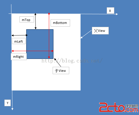 Android開發之自定義控件(二)---onLayout詳解
Android開發之自定義控件(二)---onLayout詳解 話說一個乞丐在看一個程序員寫程序,程序員遇到一個問題怎麼都解決不了,這時乞丐說
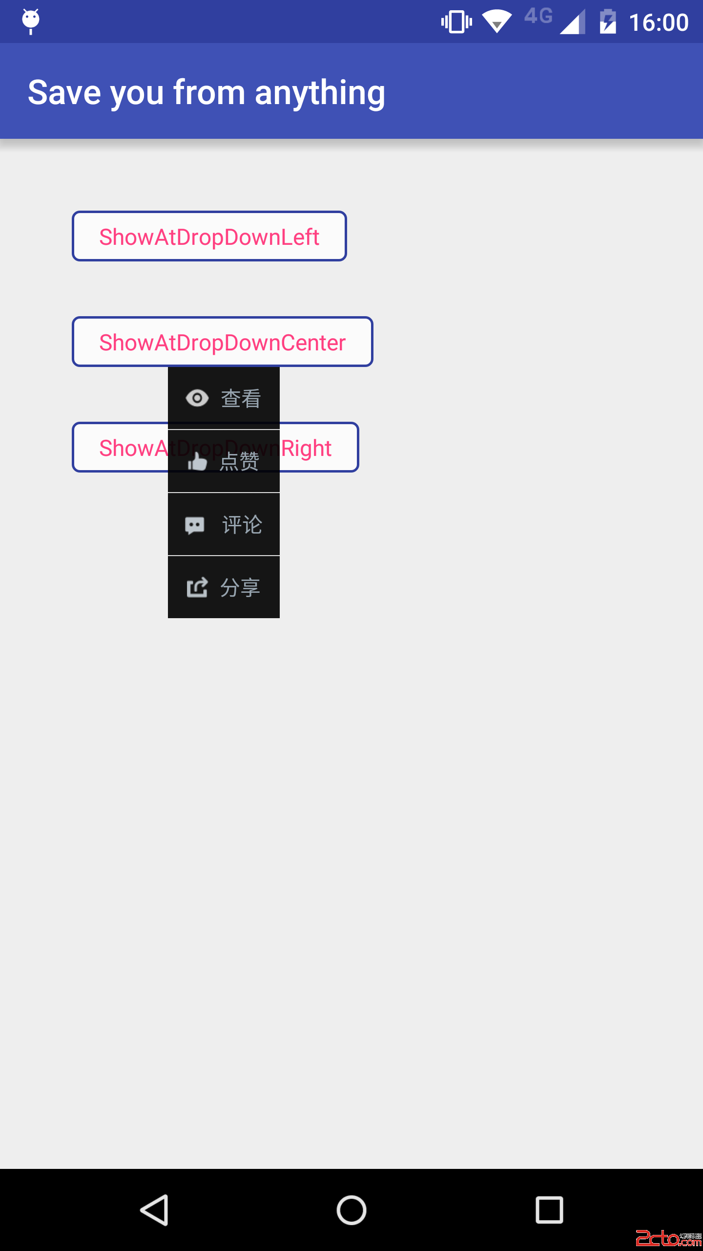 47.Android 自定義PopupWindow技巧
47.Android 自定義PopupWindow技巧 47.Android 自定義PopupWindow技巧 Android 自定義PopupWindow技巧 前言 P
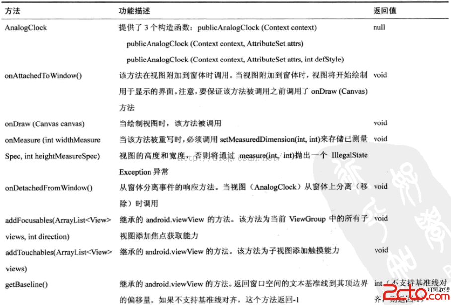 閱讀《Android 從入門到精通》(16)——表狀時鐘
閱讀《Android 從入門到精通》(16)——表狀時鐘 表狀時鐘(AnalogClock) java.lang.Object; android.view.View; a
 android學習筆記之ImageView的scaleType屬性
android學習筆記之ImageView的scaleType屬性 我們知道,ImageView有一個屬性叫做scaleType,它的取值一共有八種,分別是:matrix