編輯:關於Android編程
Android實現天氣預報溫度/氣溫折線趨勢圖
天氣預報的APP應用中,難免會遇到繪制天氣溫度/氣溫,等關於數據趨勢的折線或者曲線圖,這類關於氣溫/溫度的折線圖,一般會有兩條線,一條是高溫線,一條是低溫線。
我之前介紹了一個Android平台上第三方開源框架的統計圖表庫MPAndroidChart(文章鏈接地址:http://blog.csdn.net/zhangphil/article/details/47656521 ),具體使用方法詳情請看這篇文章。
現在基於Android平台上的MPAndroidChart實現氣溫/溫度折線圖。
主Activity:MainActivity.java的全部代碼:
package zhangphil.chart;

import java.text.DecimalFormat;
import java.util.ArrayList;

import android.app.Activity;
import android.graphics.Color;
import android.os.Bundle;

import com.github.mikephil.charting.charts.LineChart;
import com.github.mikephil.charting.components.Legend;
import com.github.mikephil.charting.components.Legend.LegendForm;
import com.github.mikephil.charting.components.Legend.LegendPosition;
import com.github.mikephil.charting.components.XAxis;
import com.github.mikephil.charting.components.XAxis.XAxisPosition;
import com.github.mikephil.charting.components.YAxis;
import com.github.mikephil.charting.components.YAxis.AxisDependency;
import com.github.mikephil.charting.data.Entry;
import com.github.mikephil.charting.data.LineData;
import com.github.mikephil.charting.data.LineDataSet;
import com.github.mikephil.charting.utils.ValueFormatter;

public class MainActivity extends Activity {

	@Override
	protected void onCreate(Bundle savedInstanceState) {
		super.onCreate(savedInstanceState);

		setContentView(R.layout.activity_main);

		LineChart mChart = (LineChart) findViewById(R.id.chart);
		setChart(mChart);

		// 制作5個數據點。
		setData(mChart, 5);

		Legend l = mChart.getLegend();
		l.setForm(LegendForm.LINE);
		l.setTextSize(12f);
		l.setTextColor(Color.BLACK);
		l.setPosition(LegendPosition.BELOW_CHART_CENTER);

		XAxis xAxis = mChart.getXAxis();

		// 將X坐標軸的標尺刻度移動底部。
		xAxis.setPosition(XAxisPosition.BOTTOM);

		// X軸之間數值的間隔
		xAxis.setSpaceBetweenLabels(1);

		xAxis.setTextSize(12f);
		xAxis.setTextColor(Color.BLACK);

		YAxis leftAxis = mChart.getAxisLeft();
		setYAxisLeft(leftAxis);

		YAxis rightAxis = mChart.getAxisRight();
		setYAxisRight(rightAxis);
	}

	private void setChart(LineChart mChart) {
		mChart.setDescription(@ http://blog.csdn.net/zhangphil);
		mChart.setNoDataTextDescription(如果傳遞的數值是空,那麼你將看到這段文字。);
		mChart.setHighlightEnabled(true);
		mChart.setTouchEnabled(true);
		mChart.setDragDecelerationFrictionCoef(0.9f);
		mChart.setDragEnabled(true);
		mChart.setScaleEnabled(true);
		mChart.setDrawGridBackground(true);
		mChart.setHighlightPerDragEnabled(true);
		mChart.setPinchZoom(true);
		mChart.setBackgroundColor(Color.LTGRAY);
		mChart.animateX(3000);
	}

	private void setYAxisLeft(YAxis leftAxis) {
		// 在左側的Y軸上標出4個刻度值
		leftAxis.setLabelCount(4, true);

		// Y坐標軸軸線的顏色
		leftAxis.setGridColor(Color.RED);

		// Y軸坐標軸上坐標刻度值的顏色
		leftAxis.setTextColor(Color.RED);

		// Y坐標軸最大值
		leftAxis.setAxisMaxValue(50);

		// Y坐標軸最小值
		leftAxis.setAxisMinValue(10);

		leftAxis.setStartAtZero(false);

		leftAxis.setDrawLabels(true);
	}

	private void setYAxisRight(YAxis rightAxis) {
		// Y坐標軸上標出8個刻度值
		rightAxis.setLabelCount(8, true);

		// Y坐標軸上刻度值的顏色
		rightAxis.setTextColor(Color.BLUE);

		// Y坐標軸上軸線的顏色
		rightAxis.setGridColor(Color.BLUE);

		// Y坐標軸最大值
		rightAxis.setAxisMaxValue(30);

		// Y坐標軸最小值
		rightAxis.setAxisMinValue(-5);

		rightAxis.setStartAtZero(false);
		rightAxis.setDrawLabels(true);
	}

	private void setData(LineChart mChart, int count) {

		ArrayList xVals = new ArrayList();
		for (int i = 0; i < count; i++) {
			xVals.add(某月 + (i + 1) + 日);
		}

		ArrayList yHigh = new ArrayList();
		LineDataSet high = new LineDataSet(yHigh, 高溫);
		setHighTemperature(high, yHigh, count);

		ArrayList yLow = new ArrayList();
		LineDataSet low = new LineDataSet(yLow, 低溫);
		setLowTemperature(low, yLow, count);

		ArrayList dataSets = new ArrayList();
		dataSets.add(high);
		dataSets.add(low);

		LineData data = new LineData(xVals, dataSets);
		data.setValueTextColor(Color.DKGRAY);
		data.setValueTextSize(10f);
		mChart.setData(data);
	}

	private void setHighTemperature(LineDataSet high, ArrayList yVals,
			int count) {

		for (int i = 0; i < count; i++) {
			float val = (float) Math.random() + 30;
			yVals.add(new Entry(val, i));
		}

		// 以左邊的Y坐標軸為准
		high.setAxisDependency(AxisDependency.LEFT);

		high.setLineWidth(5f);
		high.setColor(Color.RED);
		high.setCircleSize(8f);
		high.setCircleColor(Color.YELLOW);
		high.setCircleColorHole(Color.DKGRAY);
		high.setDrawCircleHole(true);

		// 設置折線上顯示數據的格式。如果不設置,將默認顯示float數據格式。
		high.setValueFormatter(new ValueFormatter() {

			@Override
			public String getFormattedValue(float value) {
				DecimalFormat decimalFormat = new DecimalFormat(.0);
				String s = 高溫 + decimalFormat.format(value);
				return s;
			}
		});

	}

	private void setLowTemperature(LineDataSet low, ArrayList yVals,
			int count) {

		for (int i = 0; i < count; i++) {
			float val = (float) Math.random() + 5;
			yVals.add(new Entry(val, i));
		}

		// 以右邊Y坐標軸為准
		low.setAxisDependency(AxisDependency.RIGHT);

		// 折現的顏色
		low.setColor(Color.GREEN);

		// 線寬度
		low.setLineWidth(3f);

		// 折現上點的圓球顏色
		low.setCircleColor(Color.BLUE);

		// 填充圓球中心部位洞的顏色
		low.setCircleColorHole(Color.LTGRAY);

		// 圓球的尺寸
		low.setCircleSize(5f);

		low.setDrawCircleHole(true);

		low.setValueFormatter(new ValueFormatter() {

			@Override
			public String getFormattedValue(float value) {
				DecimalFormat decimalFormat = new DecimalFormat(.0);
				String s = 低溫 + decimalFormat.format(value);
				return s;
			}
		});
	}
}
MainActivity.java需要的布局文章activity_main.xml :
運行結果如圖:
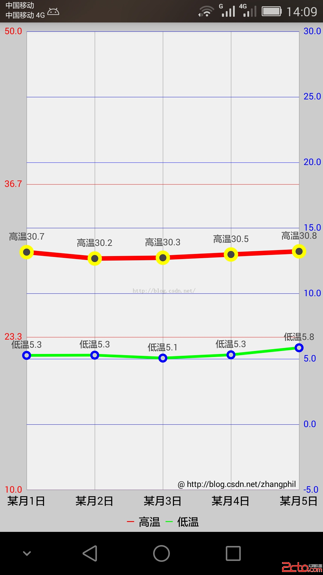
需要對MPAndroidChart的坐標體系加以說明。MPAndroidChart的Y縱坐標軸分為左右兩條縱坐標:左縱坐標軸(chart的getAxisLeft()獲得的YAxis)和右縱坐標軸(chart的getAxisRight()獲得的YAxis)。雖然它們都是MPAndroidChart中的Yaxis一個類代表,但它們在具體使用中是相互獨立的,但它們共用X坐標軸(橫坐標)。
比如在本例中,左邊的紅色Y縱坐標軸獨立代表高溫折線,它有自己獨立運行的一套繪圖機制;同理,右邊藍色Y縱坐標軸獨立代表的低溫折線,它也有自己獨立運行的一套繪圖機制。不要將兩者混為一談。
 超酷炫的Android碎紙機效果推薦
在Android開發中,有時候可能會要用到碎紙機的效果,今天小編為大家整理好代碼,一起來看看吧。首先來看下效果圖實例代碼xml<com.ldoublem.Paper
 Android學習筆記之數據的Sdcard存儲方法及操作sdcard的工具類
(1)文件的目錄 (2)各文件的代碼: FileService.java也就是操作sdcard的工具類: pa
 簡析Android五大布局(LinearLayout、FrameLayout、RelativeLayout等)
Android的界面是有布局和組件協同完成的,布局好比是建築裡的框架,而組件則相當於建築裡的磚瓦。組件按照布局的要求依次排列,就組成了用戶所看見的界面。Android的五
 Android 數據庫開發(一)SQLite3概述
前言SQLite是一款輕型的數據庫,是遵守ACID的關系型數據庫管理系統,它包含在一個相對小的C庫中。它是D.RichardHipp建立的公有領域項目,設計目標是嵌入式的