編輯:關於Android編程
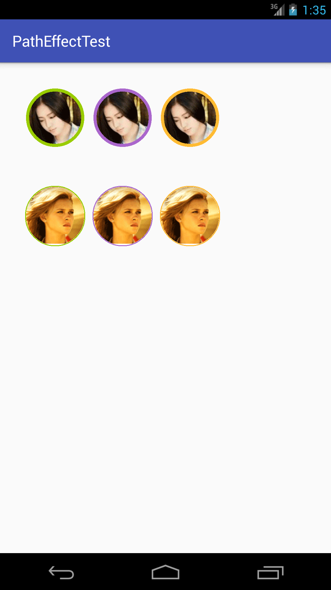
效果如下:
BitmapShader 的簡單介紹
關於 Shader是什麼,Shader的種類有哪幾種以及如何使用不屬於本文范疇,對這方面不是很了解的同學,建議先去學習一下 Shader 的基本使用。
BitmapShader主要的作用就是 通過Paint對象,對 畫布進行指定的Bitmap填充,實現一系列效果,可以有以下三種模式進行選擇
1.CLAMP - 拉伸,這裡拉伸的是圖片的最後一個元素,不斷地重復,這個效果,在圖片比較小,而所要畫的面積比較大的時候會比較明顯。
2.REPEAT - 重復,橫向縱向不斷地重復,不同於上一模式,這種模式在圖片比較小不能滿足要求是,會在橫向縱向不斷重復繪制圖形。
3.MIRROR - 翻轉,這種模式和 REPEAT 是類似的,只不過這裡的重復是翻轉著重復,和折紙的效果差不多。
而我們將要使用的是 CLAMP 模式,因為只要我們對圖形的大小進行控制,就可以避免圖像進行拉伸。
具體實現介紹
為了自定義 圖像,邊框寬度和顏色,我們首先在 res/values 目錄下,新建一個 attrs.xml文件,裡面要書寫的內容如下所示
<?xml version="1.0" encoding="utf-8"?>
<resources>
 <declare-styleable name="MyCustomView">
  <attr name="mborder_color" format="color"></attr>
  <attr name="mborder_width" format="dimension"></attr>
  <attr name="msrc" format="reference"></attr>
 </declare-styleable>
</resources>
當然,在這裡還可以添加一些其他的特性。既然定義了我們想要使用的特性,那麼我們就要在自定義View裡面 解析這些屬性並且加以利用,解析過程如下所示
 TypedArray type = context.obtainStyledAttributes(attrs, R.styleable.MyCustomView);
 mBorderColor = type.getColor(R.styleable.MyCustomView_mborder_color,0);
 mDrawable = type.getDrawable(R.styleable.MyCustomView_msrc);

 //將獲得的 Drawable 轉換成 Bitmap
 BitmapDrawable bitmapDrawable = (BitmapDrawable) mDrawable;
 mBitmap = bitmapDrawable.getBitmap();

 mBorderWidth = type.getDimensionPixelSize(R.styleable.MyCustomView_mborder_width, 2);
值得注意的是 mSrc 屬性的解析,由於獲得是 Drawable 對象,所以我們需要將其轉換為 Bitmap 對象。
下面就利用我們獲得的 Bitmap 對象進行圓形頭像的繪制,對 BitmapShader 和 Paint 的初始化如下所示
  mSrcBitmap = Bitmap.createScaledBitmap(mBitmap, mWidth, mHeight, false);
  mShader = new BitmapShader(mSrcBitmap, Shader.TileMode.CLAMP, Shader.TileMode.CLAMP);
  mPaint = new Paint();
  mPaint.setShader(mShader);
  mRadius = (mWidth - mBorderWidth * 2 - 4) / 2;
  mCircleX = (mWidth) / 2;
  mCircleY = (mHeight) / 2;
mSrcBitmap是對獲得的圖像進行適當的縮小或者放大,以適應我們對圖形的要求,而這裡的 mWidth 和 mHeight 又是什麼呢?實際上就是我們在 定義視圖在 layout_width 和 layout_height中傳遞進來的值,不過在這裡我對他們進行了處理,也就是選取最小值操作,這樣的話就可以避免由於寬大於高或者高大於寬而造成圖像填充不滿指定區域的現象。值得注意的是,自定義視圖,需要對 wrap_content 進行特殊處理,否則系統對該屬性的視圖不予以顯示。至於如何進行處理,可以看看本例的源碼,很簡單,相信很多人一看就知道或者說早就了然於胸。
還有一點需要強調的是這裡的 mRadius ,也就是將要繪制的圓的半徑,為什麼要減去邊框的寬度 乘 2 呢? 要知道,我們的圓是根據 視圖指定的寬度或者高度來畫的,如果我們所畫 的圓恰好是指定視圖的內切圓,那麼邊框放在哪裡呢?它肯定要被畫在視圖的外面,那樣我們就看不到完整的邊框了。所以,這麼減去的意義在於為邊框騰出空間。
經過以上操作,我們就已經將圓形頭像繪制出來了,下面來繪制邊框,其實非常簡單,我只不過是又定義了一個 Paint 對象,並且利用它畫了一個圓而已,畫筆的初始化操作如下所示
  mBorderPaint = new Paint();
  mBorderPaint.setStyle(Paint.Style.STROKE);
  mBorderPaint.setStrokeWidth(mBorderWidth);
  mBorderPaint.setColor(mBorderColor);
  mBorderPaint.setStrokeCap(Paint.Cap.ROUND);
好了,下面就可以在onDraw()函數中,進行繪制了,如下所示
 @Override
 protected void onDraw(Canvas canvas) {
  super.onDraw(canvas);
  canvas.drawCircle(mCircleX, mCircleY, mRadius, mPaint);
  canvas.drawCircle(mCircleX, mCircleY, mRadius, mBorderPaint);
 }
這樣,整個效果就算實現完畢了。下面來看看如何使用
 <com.example.hwaphon.patheffecttest.MyView
   android:layout_width="wrap_content"
   android:layout_height="wrap_content"
   android:layout_marginBottom="16dp"
   android:layout_marginRight="8dp"
   app:mborder_color="@android:color/holo_green_light"
   app:mborder_width="4dp"
   app:msrc="@drawable/myview_test"/>
注意,一定要在容器中加上這麼一句
xmlns:app=http://schemas.android.com/apk/res-auto
具體實現的核心代碼
package com.example.hwaphon.patheffecttest;

import android.content.Context;
import android.content.res.TypedArray;
import android.graphics.Bitmap;
import android.graphics.BitmapShader;
import android.graphics.Canvas;
import android.graphics.Paint;
import android.graphics.Shader;
import android.graphics.drawable.BitmapDrawable;
import android.graphics.drawable.Drawable;
import android.util.AttributeSet;
import android.view.View;

/**
 * Created by Hwaphon on 2016/5/12.
 */
public class MyView extends View {

 private Bitmap mBitmap;
 private Drawable mDrawable;
 private Bitmap mSrcBitmap;

 private BitmapShader mShader;
 private Paint mPaint;

 private int mWidth, mHeight;

 private int mRadius;
 private int mCircleX, mCircleY;

 private int mBorderColor;
 private Paint mBorderPaint;
 private int mBorderWidth;

 public MyView(Context context) {
  this(context, null);
 }

 public MyView(Context context, AttributeSet attrs) {
  super(context, attrs);
  TypedArray type = context.obtainStyledAttributes(attrs, R.styleable.MyCustomView);
  mBorderColor = type.getColor(R.styleable.MyCustomView_mborder_color,0);
  mDrawable = type.getDrawable(R.styleable.MyCustomView_msrc);

  //將獲得的 Drawable 轉換成 Bitmap
  BitmapDrawable bitmapDrawable = (BitmapDrawable) mDrawable;
  mBitmap = bitmapDrawable.getBitmap();

  mBorderWidth = type.getDimensionPixelSize(R.styleable.MyCustomView_mborder_width, 2);
 }

 @Override
 protected void onMeasure(int widthMeasureSpec, int heightMeasureSpec) {
  super.onMeasure(widthMeasureSpec, heightMeasureSpec);
  mWidth = measureWidth(widthMeasureSpec);
  mHeight = measureHeight(heightMeasureSpec);
  int temp = mWidth > mHeight ? mHeight : mWidth;
  mWidth = mHeight = temp;
  initView();
  setMeasuredDimension(mWidth, mHeight);
 }

 private int measureHeight(int heightMeasureSpec) {
  int size = MeasureSpec.getSize(heightMeasureSpec);
  int sizeMode = MeasureSpec.getMode(heightMeasureSpec);
  int result = 0;
  if (sizeMode == MeasureSpec.EXACTLY) {
   result = size;
  } else {
   result = 200;
   if (sizeMode == MeasureSpec.AT_MOST) {
    result = Math.min(result, size);
   }
  }
  return result;
 }

 private int measureWidth(int widthMeasureSpec) {
  int size = MeasureSpec.getSize(widthMeasureSpec);
  int sizeMode = MeasureSpec.getMode(widthMeasureSpec);
  int result = 0;
  if (sizeMode == MeasureSpec.EXACTLY) {
   result = size;
  } else {
   result = 200;
   if (sizeMode == MeasureSpec.AT_MOST) {
    result = Math.min(result, size);
   }
  }
  return result;
 }

 private void initView() {

  mSrcBitmap = Bitmap.createScaledBitmap(mBitmap, mWidth, mHeight, false);
  mShader = new BitmapShader(mSrcBitmap, Shader.TileMode.CLAMP, Shader.TileMode.CLAMP);
  mPaint = new Paint();
  mPaint.setShader(mShader);
  mRadius = (mWidth - mBorderWidth * 2) / 2;
  mCircleX = (mWidth) / 2;
  mCircleY = (mHeight) / 2;

  mBorderPaint = new Paint();
  mBorderPaint.setStyle(Paint.Style.STROKE);
  mBorderPaint.setStrokeWidth(mBorderWidth);
  mBorderPaint.setColor(mBorderColor);
  mBorderPaint.setStrokeJoin(Paint.Join.ROUND);
  mBorderPaint.setStrokeCap(Paint.Cap.ROUND);
 }

 @Override
 protected void onDraw(Canvas canvas) {
  super.onDraw(canvas);
  canvas.drawCircle(mCircleX, mCircleY, mRadius, mPaint);
  canvas.drawCircle(mCircleX, mCircleY, mRadius, mBorderPaint);
 }
}
總結
以上就是Android利用BitmapShader制作自帶邊框圓形頭像的全部內容,希望這篇文章對大家開發Android的時候能有所幫助,如果有疑問大家可以留言交流。
 Android研究之游戲開發處理按鍵的響應
1.onKeyDown 方法 onKeyDown 方法是KeyEvent.Callback 接口中的一個抽象方法,重寫onKeyDown 方法可以監聽到按鍵被按下的事件,
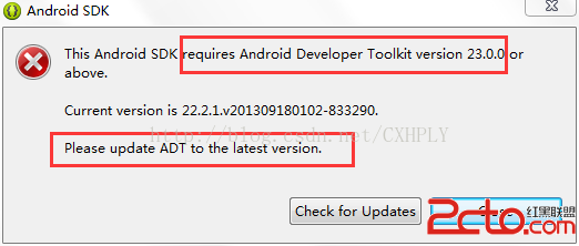 Android初學者Eclispe環境啟動遇This Android SDK requires Android Developer Toolkit version 23.0.0 or above
當我們進行Android開發,配置安裝環境Eclispe&SDK&ADT過程中,在SDK在線安裝後,重新登錄Eclispe,會出現警告框:This And
 Android Studio使用總結
安裝完android studio的初衷是為了看一個項目的源碼,因為現在的公司還在用elipse開發。。。不過,我發現,android studio還是巨好用的。就這幾天
 詳解Android中ListView實現圖文並列並且自定義分割線(完善仿微信APP)
昨天的(今天凌晨)的博文《Android中Fragment和ViewPager那點事兒》中,我們通過使用Fragment和ViewPager模仿實現了微信的布局框架。今天