編輯:Android開發實例
篇幅較長遂分成上下兩篇,上一篇我們已經快要一氣呵成了,但是美中不足的是,這個界面並不能討得美工MM的歡心,美工MM曾寄希望於您,卻交出這麼作出這麼一副死型樣,我都替你汗顏。
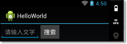
這個圖搜索按鈕看起來馬馬虎虎,但是這個搜索框真是有失我在美工MM心中的水准啊,這是因為我們把EditText和Button都的寬度都設置成按自身內容長度自適應,所以這一篇我們就來潤潤色,修一修這個布局。
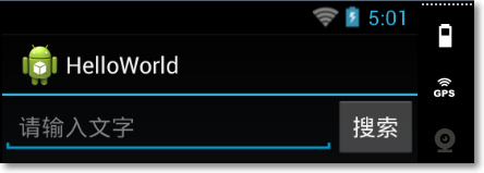
Android在布局中引入了權重的概念,即如果給設定ViewGroup的總權重是,然後可以將權重分給它的子元素View各幾份,比如我們可以這段這個例子的總權重為5,然後將EditText的權重設置4,而Button的權重設置為0,這樣EditText就會實際利用這個LinearLayout的寬度的4/5,而Button只有1/5,我們在實際開發中並不能很好的定義一個View的具體寬度,所以我們可以借助這種權重分成的方式可以很好的解決這個問題。
引入權重
layout_weight屬性即定義了權重,每一個View的默認權重為0,所以如果不顯示寫出來是0,但我這邊需要顯示的寫出Linearlayout的權重為5,EditText和Button則分別為4和1。
<LinearLayout xmlns:android="http://schemas.android.com/apk/res/android"
 xmlns:tools="http://schemas.android.com/tools"
 android:layout_weight="5"
 android:layout_width="match_parent"
 android:layout_height="match_parent"
 android:orientation="horizontal">
 <EditText android:id="@+id/edit_message"
  android:layout_weight="4"
  android:layout_width="0dip"
  android:layout_height="wrap_content"
  android:hint="@string/edit_message" />
  <Button
   android:layout_weight="1"
   android:layout_width="0dip"
   android:layout_height="wrap_content"
   android:text="@string/btn_message" />
</LinearLayout>
值得一提的是,我們在開發中可以不應該過多的使用wrap_content,因為系統並不知道這個值究竟是多少而去做更多的計算,所以我們這邊既然已經有了權重的概念,那我們就可以將EditText和Button的layout_width設置為0dip。
重新運行程序
重新運行程序,應該就可以得到我們預想的效果了。
 Android三種網絡通訊方式及Android的網絡通訊機制
Android平台有三種網絡接口可以使用,他們分別是:java.net.*(標准Java接口)、Org.apache接口和Android.net.*(Androi
 android notification 的總結分析
分類 notification有以下幾種: 1>普通notification 1.內容標題 2.大圖標 3.內
 Android登錄實例
登錄應用程序的屏幕,詢問憑據登錄到一些特定的應用。可能需要登錄到Facebook,微博等本章介紹了,如何創建一個登錄界面,以及如何管理安全問題和錯誤嘗試。首先,必須定義兩
 Android實現頂部導航菜單左右滑動效果
這篇文章主要為大家詳細介紹了Android實現頂部導航菜單左右滑動效果,具有一定的參考價值,感興趣的小伙伴們可以參考一下 本文給大家介紹在Android中如何實現頂部導