編輯:Android技術基礎
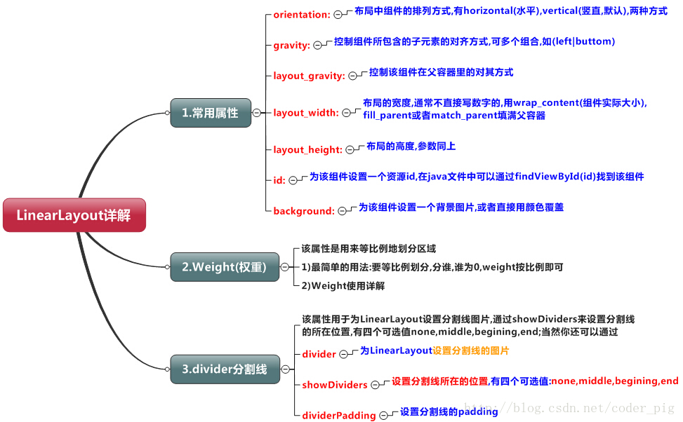
本節開始講Android中的布局,Android中有六大布局,分別是: LinearLayout(線性布局),RelativeLayout(相對布局),TableLayout(表格布局) FrameLayout(幀布局),AbsoluteLayout(絕對布局),GridLayout(網格布局) 而今天我們要講解的就是第一個布局,LinearLayout(線性布局),我們屏幕適配的使用 用的比較多的就是LinearLayout的weight(權重屬性),在這一節裡,我們會詳細地解析 LinearLayout,包括一些基本的屬性,Weight屬性的使用,以及比例如何計算,另外還 會說下一個用的比較少的屬性:android:divider繪制下劃線!
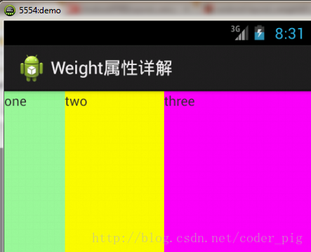
如圖:
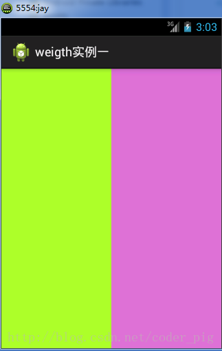
實現代碼:
<LinearLayout xmlns:android="http://schemas.android.com/apk/res/android"
    xmlns:tools="http://schemas.android.com/tools"
    android:id="@+id/LinearLayout1"
    android:layout_width="match_parent"
    android:layout_height="match_parent"
    android:orientation="horizontal">

    <LinearLayout
        android:layout_width="0dp"
        android:layout_height="fill_parent"
        android:background="#ADFF2F"
        android:layout_weight="1"/>


    <LinearLayout
        android:layout_width="0dp"
        android:layout_height="fill_parent"
        android:background="#DA70D6"
        android:layout_weight="2"/>

</LinearLayout>
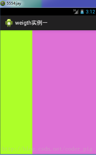
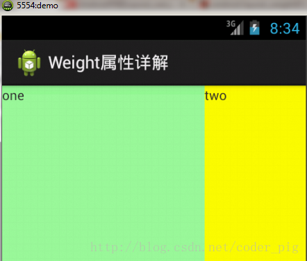
要實現第一個的1:1的效果,只需要分別把兩個LinearLayout的weight改成1和1就可以了 用法歸納: 按比例劃分水平方向:將涉及到的View的android:width屬性設置為0dp,然後設置為android weight屬性設置比例即可;類推,豎直方向,只需設android:height為0dp,然後設weight屬性即可! 大家可以自己寫個豎直方向的等比例劃分的體驗下簡單用法!
當然,如果我們不適用上述那種設置為0dp的方式,直接用wrap_content和match_parent的話, 則要接著解析weight屬性了,分為兩種情況,wrap_content與match_parent!另外還要看 LinearLayout的orientation是水平還是豎直,這個決定哪個方向等比例劃分
1)wrap_content比較簡單,直接就按比例的了
實現代碼:
<LinearLayout xmlns:android="http://schemas.android.com/apk/res/android"
    xmlns:tools="http://schemas.android.com/tools"
    android:id="@+id/LinearLayout1"
    android:layout_width="match_parent"
    android:layout_height="match_parent"
    android:orientation="horizontal" >

    <TextView
        android:layout_weight="1"
        android:layout_width="wrap_content"
        android:layout_height="fill_parent"
        android:text="one"
        android:background="#98FB98"
     />
     <TextView
        android:layout_weight="2"
        android:layout_width="wrap_content"
        android:layout_height="fill_parent"
        android:text="two"
        android:background="#FFFF00"
     />
     <TextView
        android:layout_weight="3"
        android:layout_width="wrap_content"
        android:layout_height="fill_parent"
        android:text="three"
        android:background="#FF00FF"
     />

</LinearLayout>
2)match_parent(fill_parent):這個則需要計算了
我們寫這段簡單的代碼:
<LinearLayout xmlns:android="http://schemas.android.com/apk/res/android"
    xmlns:tools="http://schemas.android.com/tools"
    android:id="@+id/LinearLayout1"
    android:layout_width="match_parent"
    android:layout_height="match_parent" >

    <TextView
        android:layout_weight="1"
        android:layout_width="fill_parent"
        android:layout_height="fill_parent"
        android:text="one"
        android:background="#98FB98"
     />
     <TextView
        android:layout_weight="2"
        android:layout_width="fill_parent"
        android:layout_height="fill_parent"
        android:text="two"
        android:background="#FFFF00"
     />
     <TextView
        android:layout_weight="3"
        android:layout_width="fill_parent"
        android:layout_height="fill_parent"
        android:text="three"
        android:background="#FF00FF"
     />

</LinearLayout>
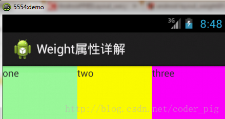
運行效果圖:
這個時候就會有疑問了,怎麼會這樣,這比例是2:1吧,那麼three去哪了?代碼裡面明明有 three的啊,還設置了3的,而1和2的比例也不對耶,1:2:3卻變成了2:1:0,怎麼會這樣呢? 答:這裡其實沒那麼簡單的,還是需要我們計算的,網上給出的算法有幾種,這裡就給出筆者 覺得比較容易理解的一種: step 1:個個都是fill_parent,但是屏幕只有一個啦,那麼1 - 3 = - 2 fill_parent step 2:依次比例是1/6,2/6,3/6 step 3:先到先得,先分給one,計算: 1 - 2 * (1/6) = 2/3 fill_parent 接著到two,計算: 1 - 2 * (2/6) = 1/3 fill_parent 最後到three,計算 1 - 2 * (3/6) = 0 fill_parent step 4:所以最後的結果是:one占了兩份,two占了一份,three什麼都木有 以上就是為什麼three沒有出現的原因了,或許大家看完還是有點蒙,沒事,我們舉多幾個例子試試就知道了!
比例為:1:1:1
按照上面的計算方法算一次,結果是:1/3 1/3 1/3,沒錯
接著我們再試下:2:3:4
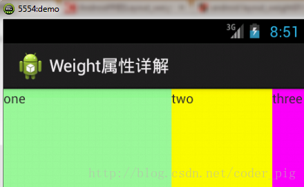
計算結果:5/9 3/9 1/9,對比效果圖,5:3:1,也沒錯,所以這個計算方法你可得mark下了!
setLayoutParams(new LayoutParams(LayoutParams.FILL_PARENT,
        LayoutParams.WRAP_CONTENT, 1));
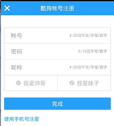
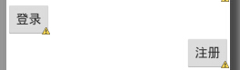
很多界面開發中都會設置一些下劃線,或者分割線,從而使得界面更加整潔美觀,比如下面的酷狗 音樂的注冊頁面:
對於這種線,我們通常的做法有兩種 ①直接在布局中添加一個view,這個view的作用僅僅是顯示出一條線,代碼也很簡單:
<View
    android:layout_width="match_parent"
    android:layout_height="1px"
    android:background="#000000" />
這個是水平方向上的黑線,當然你也可以改成其他顏色,或者使用圖片
②第二種則是使用LinearLayout的一個divider屬性,直接為LinearLayout設置分割線 這裡就需要你自己准備一張線的圖片了 1)android:divider設置作為分割線的圖片 2)android:showDividers設置分割線的位置,none(無),begining(開始),end(結束),middle(每兩個組件間) 3)dividerPadding設置分割線的Padding
使用示例:
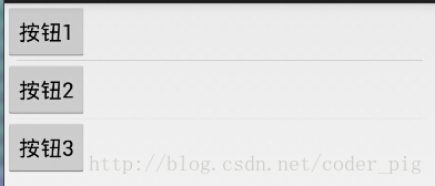
實現代碼:
<LinearLayout xmlns:android="http://schemas.android.com/apk/res/android"
    xmlns:tools="http://schemas.android.com/tools"
    android:id="@+id/LinearLayout1"
    android:layout_width="match_parent"
    android:layout_height="match_parent"
    android:divider="@drawable/ktv_line_div"
    android:orientation="vertical"
    android:showDividers="middle"
    android:dividerPadding="10dp"
    tools:context="com.jay.example.linearlayoutdemo.MainActivity" >

    <Button
        android:layout_width="wrap_content"
        android:layout_height="wrap_content"
        android:text="按鈕1" />

    <Button
        android:layout_width="wrap_content"
        android:layout_height="wrap_content"
        android:text="按鈕2" />

    <Button
        android:layout_width="wrap_content"
        android:layout_height="wrap_content"
        android:text="按鈕3" />

</LinearLayout>
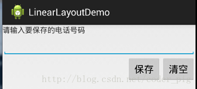
實現代碼如下:
<LinearLayout xmlns:android="http://schemas.android.com/apk/res/android"
    xmlns:tools="http://schemas.android.com/tools"
    android:id="@+id/LinearLayout1"
    android:layout_width="fill_parent"
    android:layout_height="fill_parent"
    android:orientation="vertical"
    tools:context=".MainActivity" >

    <TextView
        android:layout_width="wrap_content"
        android:layout_height="wrap_content"
        android:text="請輸入要保存的電話號碼"/>
    <EditText
        android:layout_width="fill_parent"
        android:layout_height="wrap_content"/>
    <LinearLayout
        android:layout_width="fill_parent"
        android:layout_height="wrap_content"
        android:orientation="horizontal"
        android:gravity="right">
        <Button
            android:layout_width="wrap_content"
            android:layout_height="wrap_content"
            android:text="保存"/>
        <Button
            android:layout_width="wrap_content"
            android:layout_height="wrap_content"
            android:text="清空"/>
    </LinearLayout>
</LinearLayout>
使用Layout_gravity的一個很重要的問題!!! 問題內容: 在一個LinearLayout的水平方向中布置兩個TextView,想讓一個左,一個右,怎麼搞? 或許你會脫口而出:"gravity設置一個left,一個right就可以啦!" 真的這麼簡單?你試過嗎?寫個簡單的Layout你就會發現,事與願違了: 代碼如下:
<LinearLayout xmlns:android="http://schemas.android.com/apk/res/android"
    xmlns:tools="http://schemas.android.com/tools"
    android:layout_width="match_parent"
    android:layout_height="match_parent"
    android:orientation="horizontal"
    tools:context="com.jay.example.getscreendemo.MainActivity" >

    <TextView
        android:layout_width="wrap_content"
        android:layout_height="200dp"
        android:layout_gravity="left"
        android:background="#FF7878"
        android:gravity="center"
        android:text="O(∩_∩)O哈哈~" />

    <TextView
        android:layout_width="wrap_content"
        android:layout_height="200dp"
        android:layout_gravity="right"
        android:background="#FF7428"
        android:gravity="center"
        android:text="(*^__^*) 嘻嘻……" />

</LinearLayout>
運行結果圖:
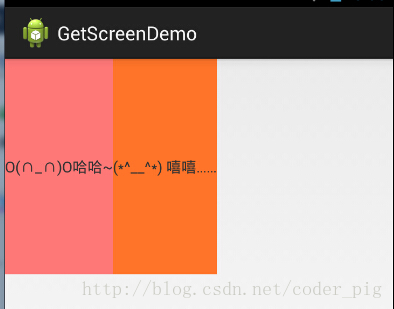
看到這裡你會說:哎呀,真的不行耶,要不在外層LinearLayout加個gravity=left的屬性,然後設置第二個 TextView的layout_gravity為right,恩,好我們試一下:
<LinearLayout xmlns:android="http://schemas.android.com/apk/res/android"
    xmlns:tools="http://schemas.android.com/tools"
    android:layout_width="match_parent"
    android:layout_height="match_parent"
    android:orientation="horizontal"
    android:gravity="left"
    tools:context="com.jay.example.getscreendemo.MainActivity" >

    <TextView
        android:layout_width="wrap_content"
        android:layout_height="200dp"
        android:background="#FF7878"
        android:gravity="center"
        android:text="O(∩_∩)O哈哈~" />

    <TextView
        android:layout_width="wrap_content"
        android:layout_height="200dp"
        android:layout_gravity="right"
        android:background="#FF7428"
        android:gravity="center"
        android:text="(*^__^*) 嘻嘻……" />

</LinearLayout>
結果還是一樣:

好吧,沒轍了,怎麼辦好?
當 android:orientation="vertical" 時, 只有水平方向的設置才起作用,垂直方向的設置不起作用。 即:left,right,center_horizontal 是生效的。 當 android:orientation="horizontal" 時, 只有垂直方向的設置才起作用,水平方向的設置不起作用。 即:top,bottom,center_vertical 是生效的。
然而,這方法好像並沒有什麼卵用。比如: 如果只能豎直方向設置左右對齊的話,就會出現下面的效果:
這顯然不是我們要的結果把! 綜上,要麼按照上述給出的規則來布局,不過對於這種情況還是使用相對布局RelativeLayout把! 網上沒給出具體的原因,都是說這樣改有人說這個和orientation的優先級有關 ,暫且先mark下來吧,後續如果知道原因的話再解釋!前面屏幕適配也說過了,布局還是建議使用 RelativeLayout!
 8.2.2 Bitmap引起的OOM問題
本節引言:上節,我們已經學習了Bitmap的基本用法,而本節我們要來探討的Bitmap的OOM問題,大家在實際開發中可能遇到過,或者沒遇到過因為Bi
 第9章、圖像按鈕ImageButton(從零開始學Android)
在Android App應用中,默認的Button按鈕盡管我們可以通過樣式變成圓角,但有時感覺仍然不夠美觀,我們可以通過采用圖像按鈕ImageButton改善這種現狀,今
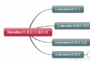 3.3 Handler消息傳遞機制淺析
本節引言前兩節中我們對Android中的兩種事件處理機制進行了學習,關於響應的事件響應就這兩種;本節給大家講解的是Activity中UI組件中的信息
 1.2.2 使用Android Studio開發Android APP
寫在前面本節將介紹如何使用Android Studio開發Android APP,和前面Eclipse + ADT + SDK搭建Android開發